TaxSlayer Pro Ecommerce
Summary: In a market-leading effort to bring self-serve purchasing online, TaxSlayer Pro built a custom interface to connect to their pre-existing back office transaction systems. I was the sole designer on this project, doing everything from information architecture to high-fidelity user interface design. I conducted usability testing on the production software. When the solution was scaled out, it got real-world usage immediately, in higher volume than expected.
What We Were Trying to Accomplish
In the professional tax software space, it’s not so common to be able to purchase the software directly online. Usually, you have to call a phone number to buy. TaxSlayer Pro decided to be a leader in the market and enable the ability to purchase the TaxSlayer Pro product on the website, taxslayerpro.com.
The back office systems to process purchases already existed; these were the systems sales was already using to process transactions.
All that was needed to enable the ability to buy online was a frontend, connected to the existing back office systems.
Why Custom?
You might be wondering, why not using a 3rd party, turn-key tool like Stripe or something? Why build an ecommerce flow from scratch? The company considered 3rd party options, but ultimately went the custom route, for a few reasons
- The back office systems were already in place
- More control over costs and fees
- Stability
- Predictability
- Preserving downstream integrations from dependent back office systems
So, this was not reinventing the wheel. It was bringing a capability online in a pre-existing ecosystem that was ready for a frontend.
Getting Clear: What Will We Support, Exactly?
Since there are a ton of established conventions for ecommerce interfaces, this project was moreso a matter of getting clear on what kinds of capabilities we wanted to provide.
Stakeholder Brainstorming Workshop
The team kicked off the project with a brainstorming workshop. The product stakeholders ran this workshop, wherein each stakeholder (sales, marketing, UX, product, and development) simply wrote out several sticky notes (using Zoom’s virtual whiteboard tool).
For the most part, we brainstormed feature ideas. This was helpful for me, to get a sense of what the other stakeholders had in mind going into this project.
Talking Through It
I took the ideas from the workshop, ideas that I gathered from research online, and ideas I came up with myself, and I mapped out a flow chart of an ecommerce user flow.
From there, I held two hour-long meetings with product and sales stakeholders. In those meetings, we discussed thoughts on what’s important to support in the initial launch of this project. We discussed lots of business logic, and how the back office system works. I documented product’s and sales’ thoughts as a column of text underneath each step in the user flow. This way, we’d talked through a lot of the possibilities before I’d even begun any designs.
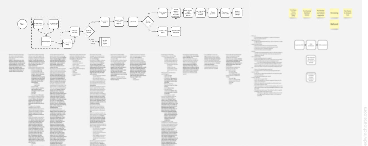
After I understood what the stakeholders had in mind, I created a Miro board where I identified each affordance (functionality the experience will afford) that I could consider putting into the experience from the perspective of the user. As I did this, I considered the features stakeholders were asking for as well as features they hadn’t mentioned.
Early Iterations
As I began to work out early ideas for how the experience should flow, I used Sketchy, a wireframing library I built, to work out some early concepts in low-fidelity (Article: Sketchy Wireframe System). I often use Sketchy to work out quick, throwaway ideas in the beginning of the ideation process.
As I mocked up these early concepts, I met with product and sales to ask them questions like:
- What data must be collected before we run a transaction?
- What are your thoughts about accepting purchases without a user account? (i.e. guest checkout)
- How fast is our credit card processing system?
- If a customer starts a transaction online and decides to finish the transaction over the phone, what are the operational steps we would want to take?
- Etc.
Each one of these questions is its own conversation really. Depending on the answers to these questions, it affects what the ideal design would be.
Further Iterations
As the bigger picture pieces started to fall in place, I focused the next iterations on smaller, more detailed problems.
At this point, I was considering questions like:
- How will the user add items to their order?
- If we were to support alternative payment methods like Venmo, PayPal, Apple Pay, etc., where would that fit into the flow?
- Could we collect vital contact info upfront, and formally finish creating the account later? Would this lower perceived friction?
- How might the user preview their order?
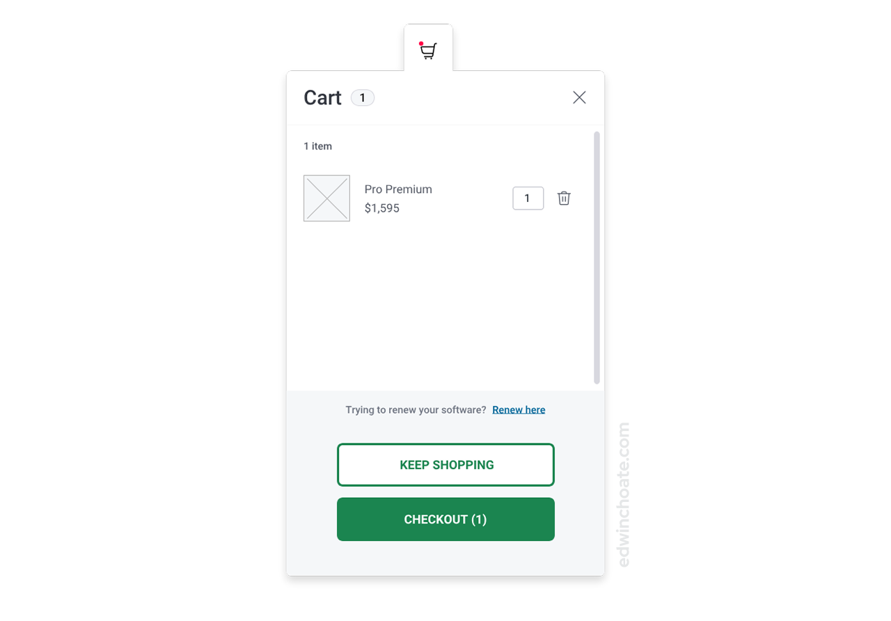
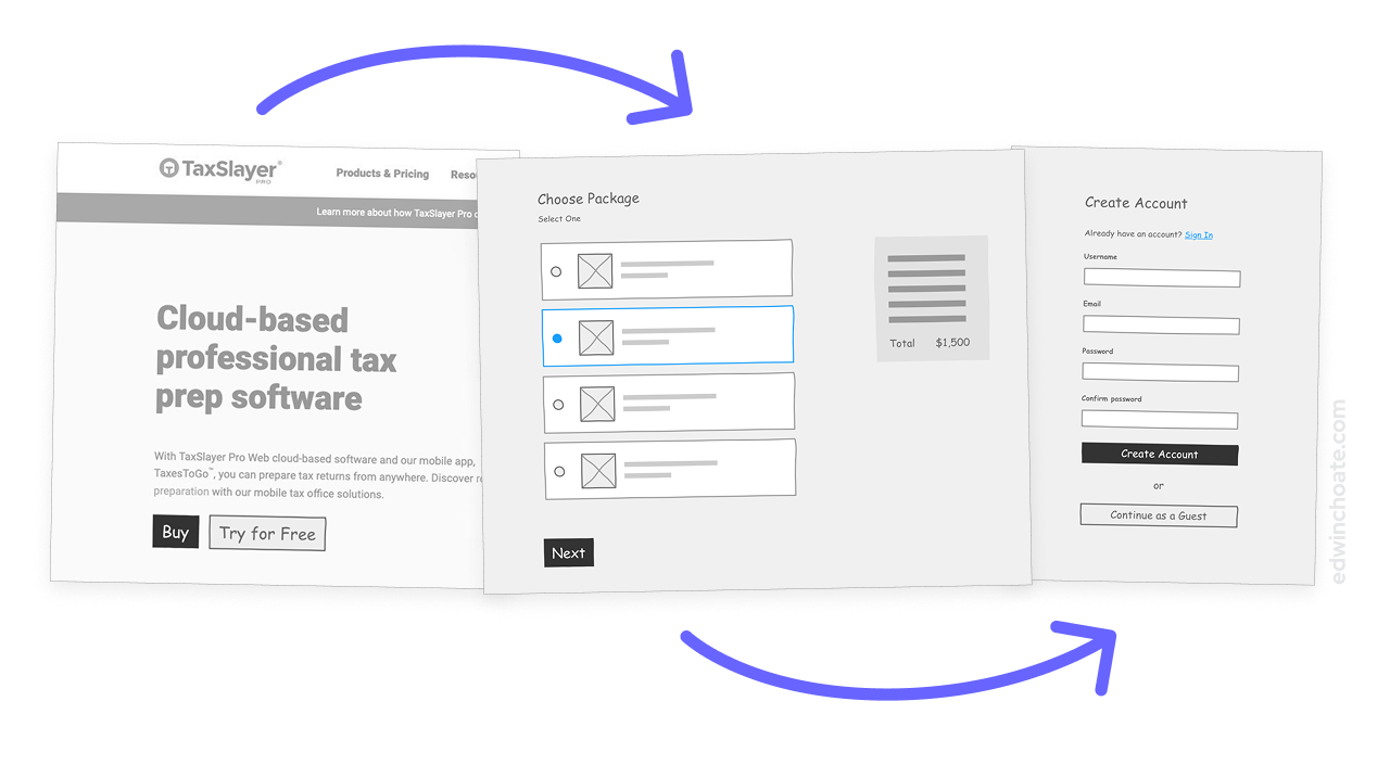
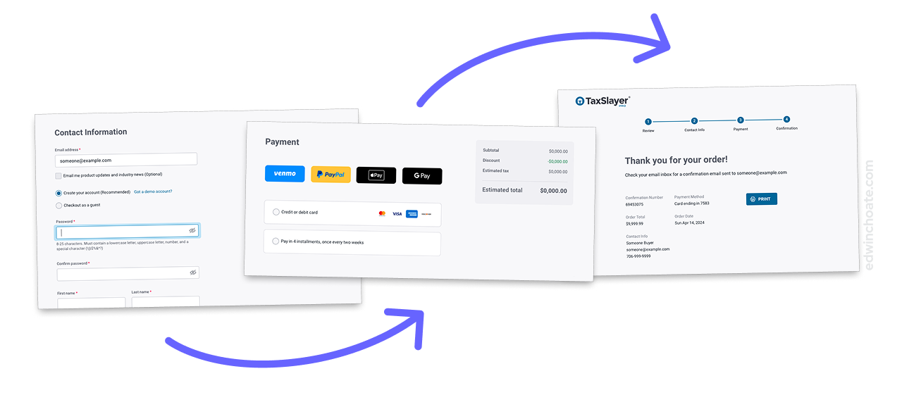
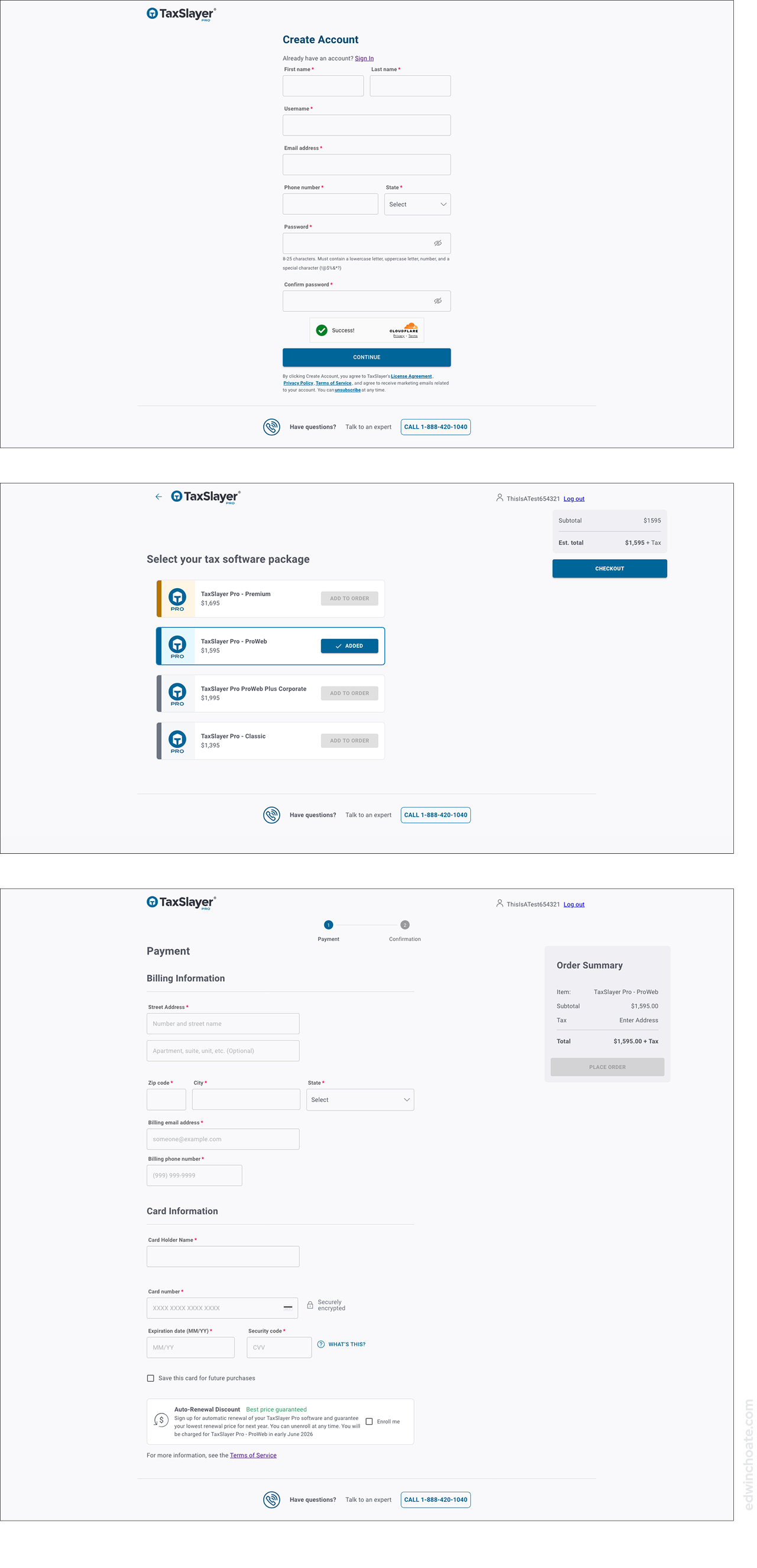
After discussions with stakeholders, I realized it would be adding significant technical effort to introduce a shopping cart. Since the user would likely only have one thing to purchase, the software, there wasn’t much value in having a cart: it’d be a cart that’d always hold just one item. So, I decided it’d be best to simplify the whole thing and have the choice of product package be integrated into the purchase flow, removing the need to have a cart.
Among other things, removing the cart mitigated an important risk: the risk of an existing customer thinking the way they’re supposed to renew their software is to repurchase it online (which is not correct). We were able to work out a flow that did the proper routing automatically to prevent this error scenario.
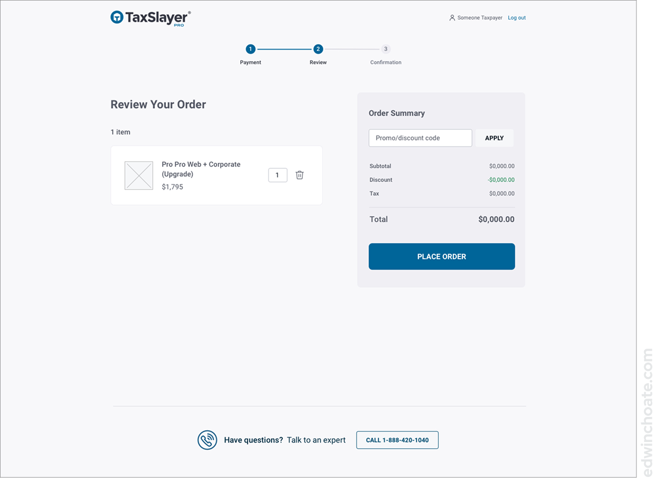
As I iterated through more design ideas, I continued to simplify the design, removing unnecessary steps, and trimming down what was on the screen. Most of the improvements from iteration to iteration involved subtracting things rather than adding.
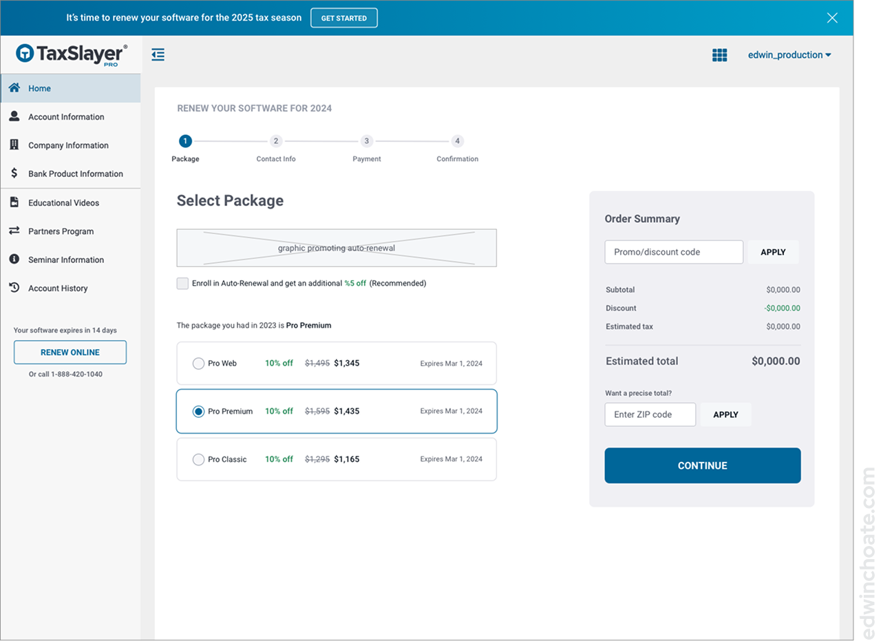
By this time, I knew it was a requirement that existing customers should be able to renew their software after logging in with their credentials. I had been fixated on embedding the renewal purchase flow inside of the logged-in software experience. I realized there was another opportunity to simplify — removing the navigational elements from the side and top of the screen to make the logged-in renewal experience much more similar (almost identical) to the first-time buyer experience. This change further simplified the design, improving consistency and reducing the effort required to build and maintain both experiences.

Future-Proofing the Design
With no cart and no Review page, I was worried we might decide to sell other products on the site in the future and that might break the design. There was no talk of doing that in the foreseeable future, but that could change. I wanted the design to hold up to that.
I felt that I needed to have a strategy for accommodating more products and fitting that into the existing design patterns.
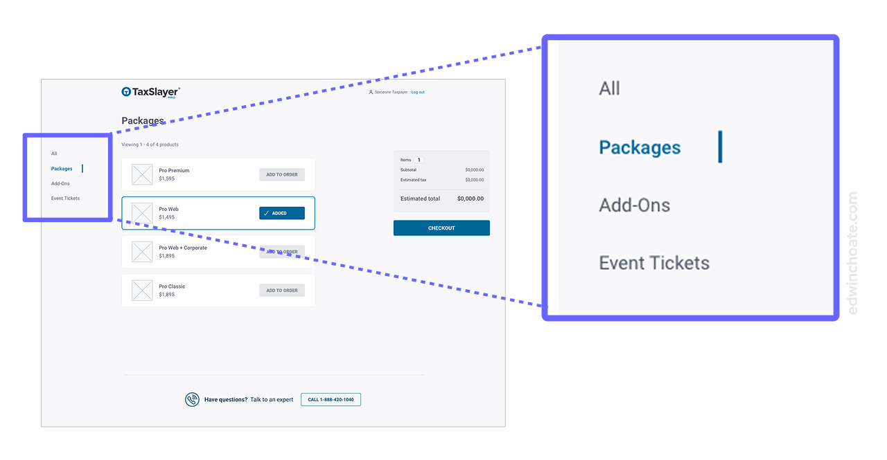
I created a side menu which worked sort of like “pages” in a “store”. If we decided to list more products in the future, they could be here, on their own page.
I worked with engineering to confirm:
- We could add a side nav with pages to the “store”
- We could “remember” what the user clicked on from the marketing site (e.g. using something like a query param)
- Based on what the user clicked, we could route them to the appropriate page in the “store”
In my mind, once I confirmed we’d be able to do something like this, I felt the design was properly future-proofed.
Product Thumbnails: Helping Users Understand Their Options
Nobody was asking for this, but it became clear to me that the purchase experience needed to have a visual way of differentiating between the products. I saw this as a way to make the interface easier to use, and (more importantly) reduce errors. The only thing that would be purchasable was the main product, TaxSlayer Pro, but there were four different package levels you could choose from.
I realized I needed to make a set of visuals that accomplished these things:
- Convey that this is the main product, TaxSlayer Pro
- Convey that you are choosing between different packages of the same thing
- Be visually appealing and simple, not distracting
- Be on-brand
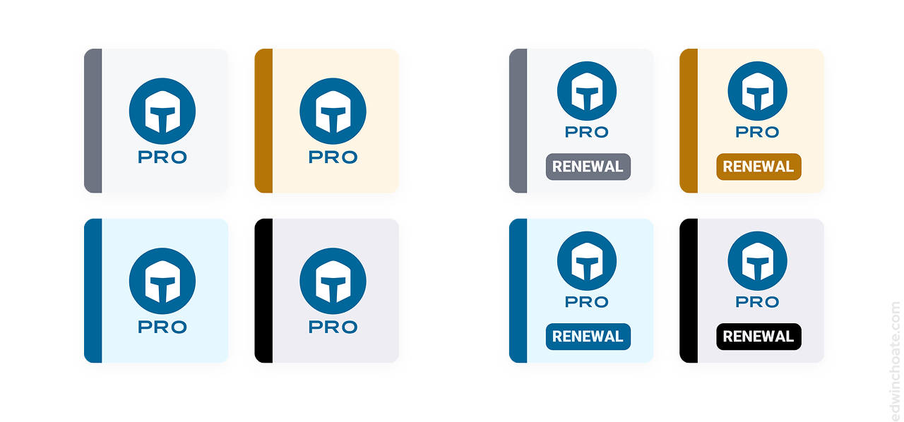
I chose blue for the Pro Web package, because blue is the main brand color, and that package is your most common option. I chose grey for the Classic package because it’s your more basic option. I chose gold for Premium as is often the convention.
Again, no one was asking for this but I knew it’d help users understand what was going on if the renewal items looked different. The renewal is a different SKU, and I felt it was important to help the user understand that.
Putting It All Together
As I converged on a proposed design, I began to see the theme of what I was changing: simplification. I was simplifying wherever possible. This is meaningful, because we know from research that the shorter you can make your checkout process, the better it performs.
I continued trimming things where I could, removing or auto-populating inputs, shortening the page, and so forth.
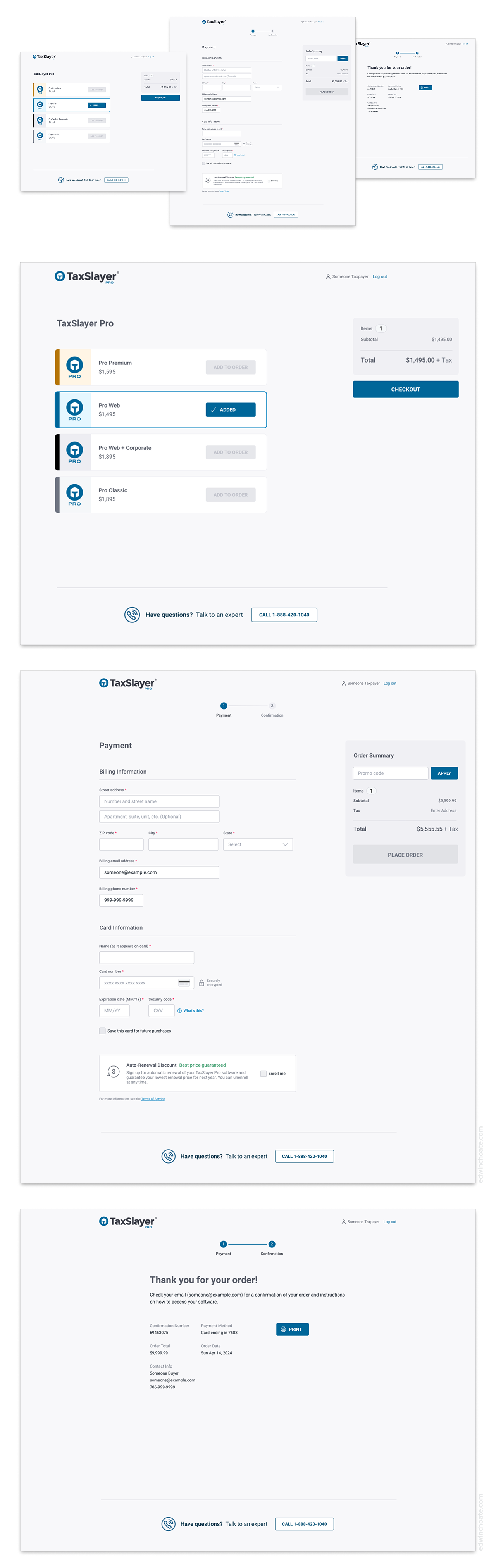
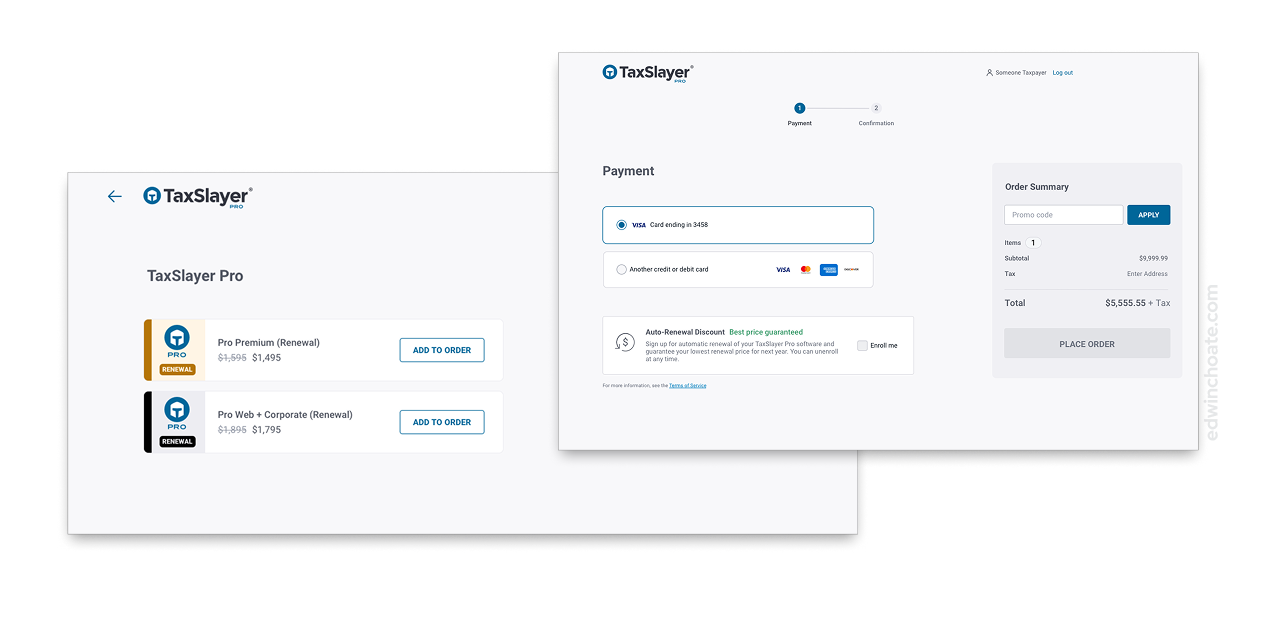
By removing the shopping cart, and by having an account screen at the beginning of the flow, we were able to redirect the user to the appropriate purchase flow (first-time purchase or renewal), based on their user account. This forcing function is one of the things I’m most proud of in this project. It is a totally invisible, yet vital piece of usability that prevents errors from ever happening. Could you imagine paying over a thousand dollars only to realize you bought the wrong thing?!
Usability Testing
The business stakeholders planned to slowly roll out this project, making it only visible to a small audience initially. This gave us time to test the usability of the real thing, before scaling its usage out to many people.
I socialized the idea that the main objective was to perform a “smoke test”. My main concerns were with the unanticipated unknowns… navigational or informational user needs going unmet or unforeseen technical hurdles with the brand-new frontend. I saw much more value in testing the real, live system as opposed to a click-thru prototype. Ecommerce interfaces are so conventional that I felt confident it would be familiar to people. We didn't need to validate the interface design; we needed to accelerate the discovery of unforeseen issues, the unknowns. I put together a test plan that would be ready to run as soon as we got the system running in a production environment.
The Test Plan
The goals of the unmoderated study were threefold:
- Smoke test the usability of the solution
- Understand what it’s like for users to find where to go to buy online, on the existing website
- Identify opportunities for improvement
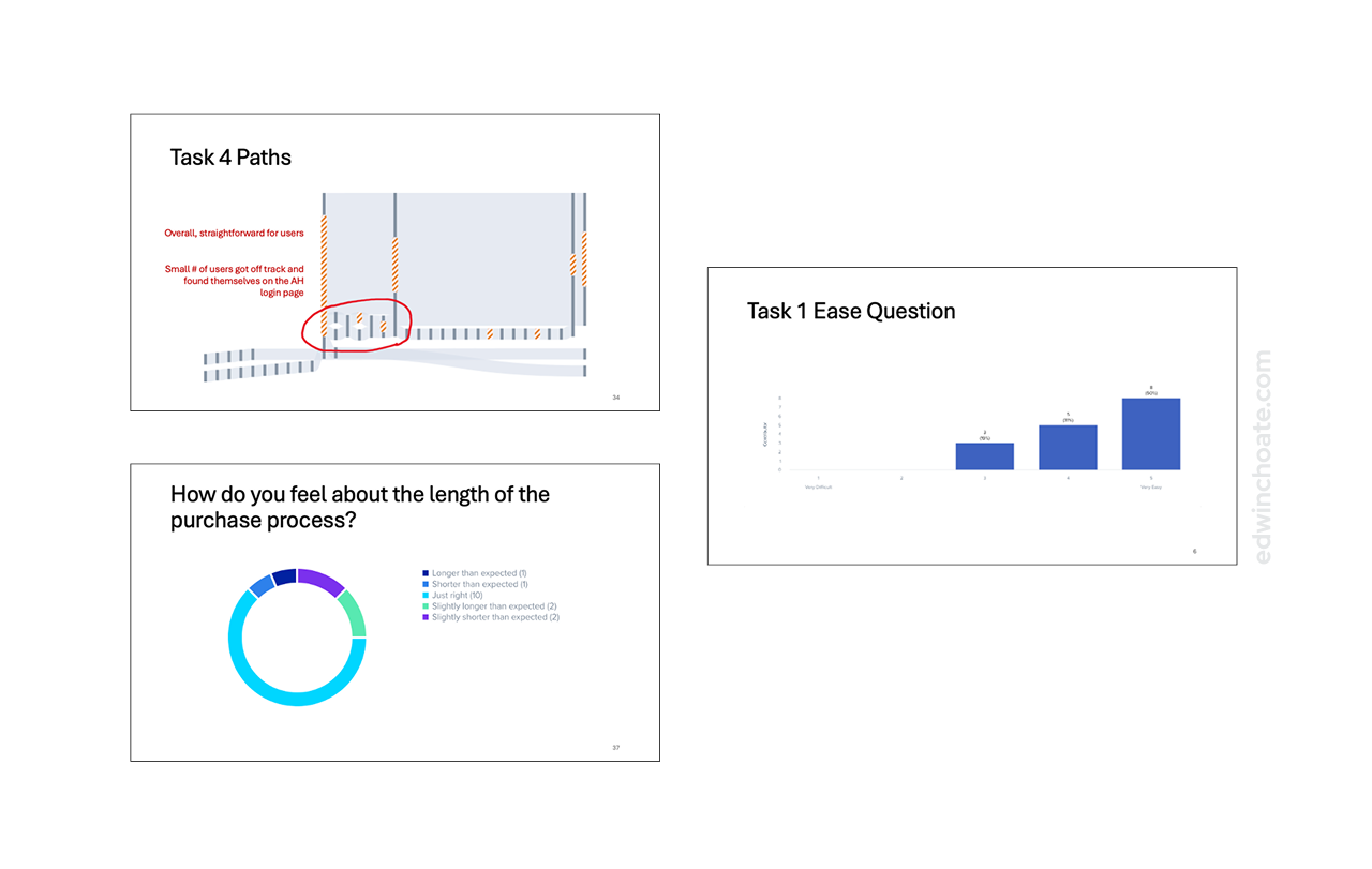
I ran the test on UserTesting.com and I had a sample size of N = 16.
The test had the users perform six tasks, spanning from browsing the website to finishing a purchase.
Each task measured:
- Ease of use (on a scale from 1-5)
- Time on task
- Navigation paths
- Qualitative written feedback
I watched all of the session videos, noting user quotes and behaviors as they performed their tasks.
The Test Results
The test showed that there were no major issues with the primary concern: the ecommerce flow. This is of course always the answer you’d like to see. (There’s no way to know until you test, though.)
The test led to a few interesting insights:
- There were some navigational issues finding product information
- Users wanted to read more information about the products
- People gravitate to comparison charts, a lot. (Maybe this is already a known thing, but it was new to me.)
What Was Built
In all, I’m proud of how similar the actual, built software was to the intended design. This is both a testament to the engineering team, as well as a testament to the simplicity of the design.
Successful Results
Once we got everything in place, tested the experience, and felt confident in it, we began to make it more prominent on the website. Users took to it quickly, and in larger numbers than I personally expected.
As of this writing, in less than one tax season, there have been:
- 2 zeroes of purchases go through the new ecommerce experience
- 3 zeroes of renewals go through the new ecommerce experience
- 2 zeroes of auto-renewals enrolled via the new experience
- 2 zeroes of stored cards on file enrolled via the new experience
My Role
On this project, I was the sole designer. I performed the UX design, UI design, and user research. I worked with a product manager, a product owner, and a team of a few software developers (most of whom were backend developers, and one frontend developer).
Hats I wore in this project:
- Interaction designer
- UI designer
- Facilitator (I did not facilitate the brainstorming workshop, but I did facilitate the two workshop sessions that followed.)
- Usability researcher
- Project planner (of the design backlog)
I populated and managed a design backlog for this project, which I used to organize design work items into v1, v2, and v3 buckets to make sure we didn’t forget the more future-oriented ideas that didn’t make it into v1.
Conclusion
While the user interface aspects of this project are not novel, I was honored that the company entrusted me to create an experience that would process a high volume of mission-critical transactions. It was thrilling to play such a large design role in this project, and I felt a genuine sense of pride when I saw engineering demo the built version of the software. One of the things this project showed me is that going through multiple design iterations upfront can immediately pay off. I got to see that in action. If we had tried to push earlier iterations (which weren’t as simple), there’s no guarantee that code, testing, and adoption would’ve been as smooth or as successful as they were.
Let's Get in Touch
Email me at hello@edwinchoate.com, or connect with me on LinkedIn.
Read More
Only got a minute? Check out the showcase.