
TaxSlayer Pro Design System
Summary: I built the TaxSlayer Pro design system as a team of one, using Eva Design System as the base and extending it from there. I developed the initial version of the design library over the span of two weeks, incorporating the visual styles from the company's existing style guide as I went.
The Need
When I started at TaxSlayer Pro, the company didn’t have a design system in place yet. (At the time, there was a static style guide.) This proved to be a problem from an efficiency standpoint, because I was having to reinvent the wheel - creating high-fidelity components as I went - to produce design outputs for my stakeholders. Additionally, there was the risk of inconsistent design deliverables: without a systematized component set, I was introducing the likelihood that I would implement the same component in slightly different ways, creating extra work for the development team while also introducing inconsistencies into the product.
I needed a design system. The biggest challenge I was up against was resource constraints. As a UX team of one, I was the sole UX designer responsible for a little bit of everything (research, information architecture, and user interface design). To fulfill my day-to-day job responsibilities while also spinning up a design system, I needed to do the work of creating the design system very efficiently.
The Solution
I decided to create a temporary design system to meet this need. The fundamental solution I arrived at involved four key assumptions:
- To start, I would create only the design library (the design half of the system)
- I would find a resource on the web that gave me “the pipes” for free so I could accelerate the project
- I would intentionally and strategically accept some degree of aesthetic compromise between the company’s style guide and the innate style decisions of the base design kit I chose
- I would plan this project during a time when most stakeholders were out-of-office so that I could sink time into this without disrupting product team priorities
Finding a Good Base System (with Pipes)
The main thing I was looking for when scouring the internet was a design library with most of the components one would need (buttons, form inputs, etc.) to have in place with what I call “the pipes” already wired up. When I say, “the pipes”, I mean the sum of all the relationships one sets up in the system: connecting text styles to color palettes, connecting variations to their parent components, connecting atoms to molecules, and so on. I knew I needed to find this, because I was familiar with how time-consuming it can be to wire all that up, and I simply didn’t have the time. I also was looking for a system that was relatively low-cost.
The system I ended up going with was Eva Design System. Eva is built by a consultancy that does design systems, and they offer a free system that provides a great foundation, with many pipes pre-wired right out of the box. It was exactly what I was looking for.
Transitioning Styles
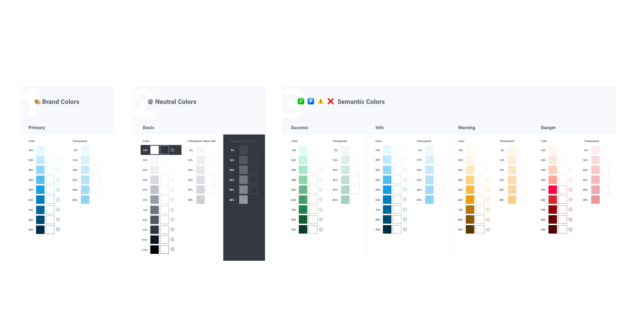
I already knew what styles to use in the system, because they were clearly defined in the company style guide, as well as in the design of the products themselves. I internalized the design choices that went into the existing style guide. Taking those to heart, I forked Eva Design System and used “the pipes” to transition the look of the system into the TaxSlayer look and feel.
I did this by replacing the underlying values of the atoms in the system and working my way “up” the system (from atoms to molecules and so on), checking to make sure the new values (colors, font styles, etc.) did not “break” things in the system as the changes propagated upward throughout the system. As I went, I tested the lower levels of the system, and I took the opportunity to implement Smart Layout (Sketch’s equivalent of Figma’s Auto Layout) where appropriate.
An Unexpected Hurdle: Icon Styles
For the most part, Eva Design System had in it what I needed it to. This was of course by design, since I was looking for a system that had what I needed from the outset. There was one thing it lacked, however: icon styles that worked well with outline-style icons. I had run into a technical challenge with how SVGs, Layer Styles, and the Eva Design System interacted, which resulted in me having to extend the system by adding a set of icon styles.
I did this by copying the architectural conventions Eva had already established with other sets of styles (color styles, text styles, etc.) and I made an analogous set of styles for the icons that followed the same conventions. Unfortunately, this did mean that I would have to great some “pipes” from scratch; this did end up being one of the most time-consuming parts of the project.
The company used streamline to source the icon assets. I developed a system for adding a new icon to the library, and I documented the process in-context in the design system Sketch file so that other designers would know what to do to contribute.
The Result
I was able to get this system in place from start to finish over the span of two weeks, while many stakeholders were on vacation with their kids over spring break. Most of my time was spent on changing styles, testing changes, implementing Smart Layout, and adding the icon system.
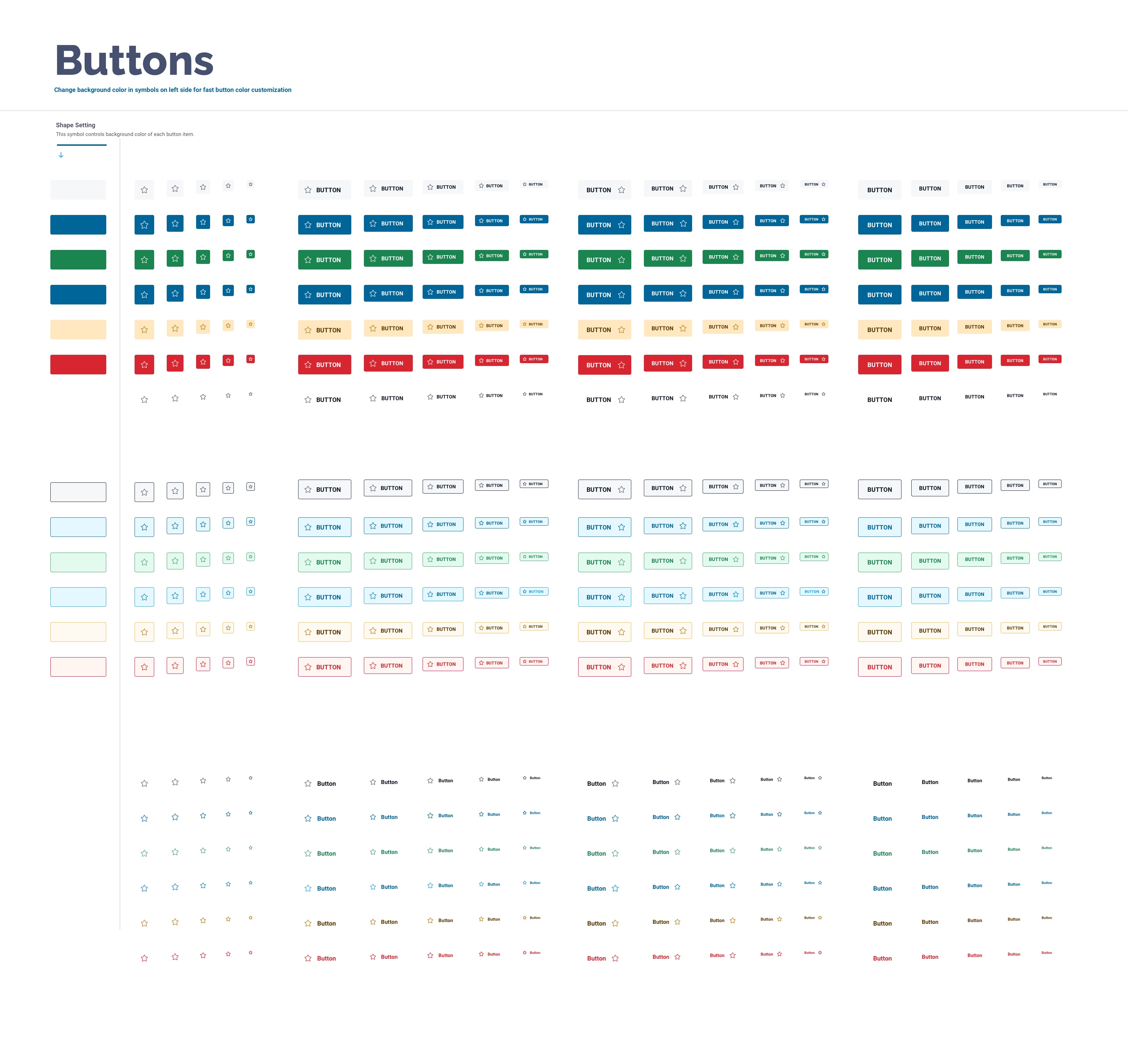
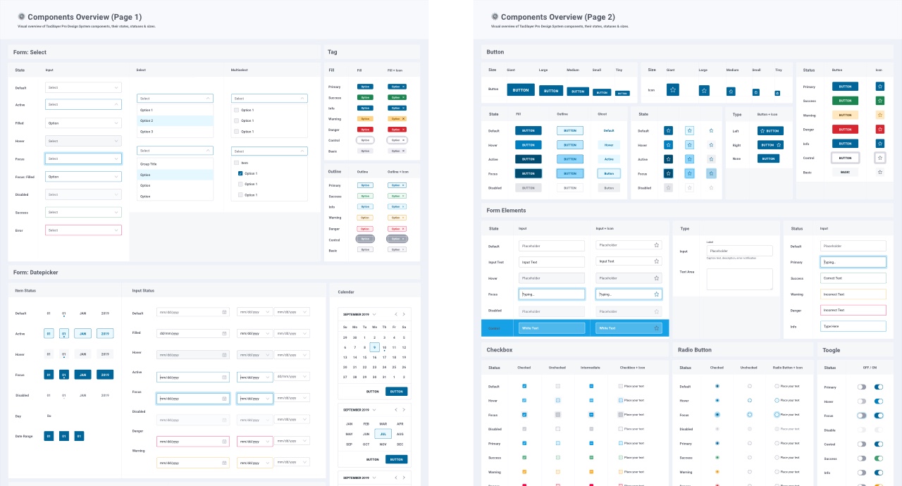
Beyond the components that came with Eva Design System, I extended the system by adding a few more components, which included:
- Alerts
- Badges
- Dialog
- Modal
- Toasts
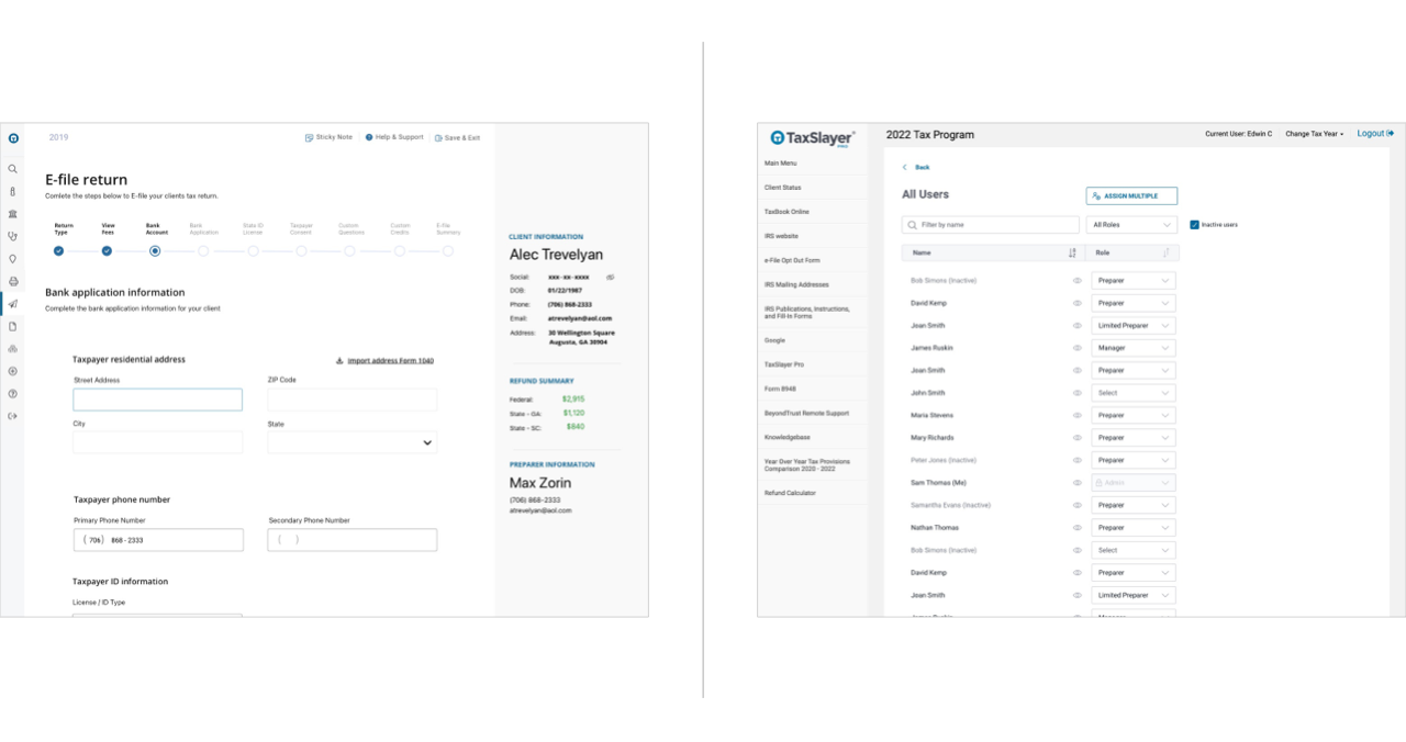
I was able to get Eva to look like TaxSlayer Pro’s existing style guide while accepting some small compromises along the way. Below is an example of a screen designed before the design system (using the style guide) next to a screen that was design after the design system (using the styles in the forked Eva Design System I made). As you can see, it isn’t a perfect aesthetic match, but it was close enough for my purposes. It was worth making this compromise to gain the benefits that come from having a systematized design library.
Conclusion
As a UX team of one, I knew both the importance of having a design system, and the necessity of creating one as efficiently as possible. I sought out to make strategic compromises such as forking a pre-made system and accepting a minor level of visual design inaccuracies. By making these compromises, I was able to significantly accelerate the execution of the project, resulting in an initial version of the design library in just two weeks from the start date. I have used this design library for high-fidelity user interface design ever since. In all, I was successful at quickly building a design library that works for my practical needs as a user experience designer at TaxSlayer.
Let's Get in Touch
Email me at hello@edwinchoate.com, or connect with me on LinkedIn.
Read More
Only got a minute? Check out the showcase.