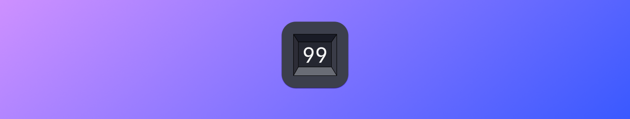
Tally Counter
The Goal
This project was just for learning purposes (and for fun). The idea of this project was to go from an idea to a published app on the app store and do every step in between myself from scratch. I wanted to mount the learning curve of bumping into all of the unexpected things I’d encounter along the way. To accelerate this project, I gave myself a constraint: I must create the simplest app that I can think of, and the app must be a complete solution to some problem.
(I did not use any AI tools for this project.)
After brainstorming, I decided a tally counter app met my criteria.
What’s a Tally Counter?
A tally counter is a simple device that solves a simple problem: you might forget and “lose your place” when you’re trying to count something. It’s a way of getting a number out of your head and into the world.
Designing the App
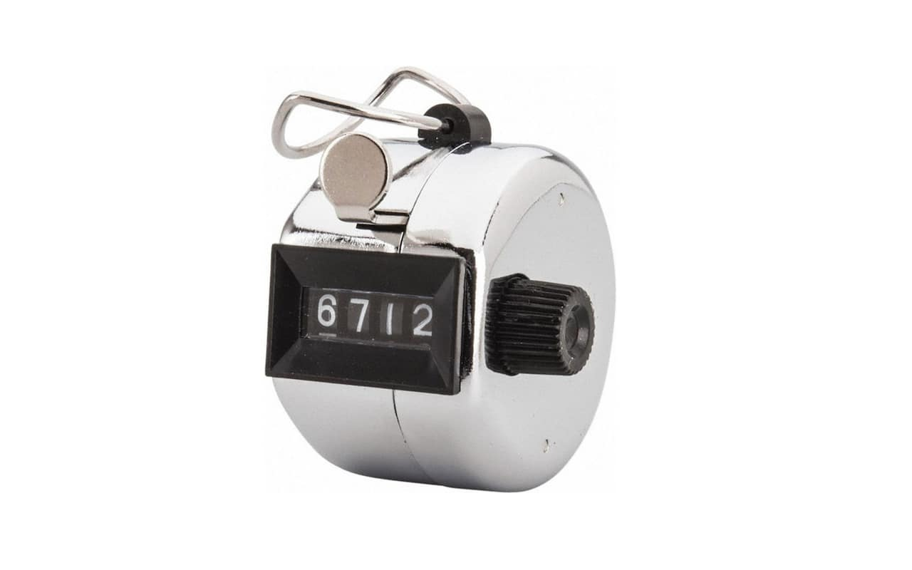
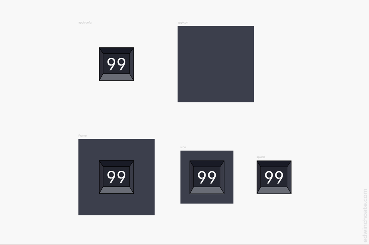
I decided it would make the UX designer in me happy if there was a skeuomorphic metaphor in the app’s interface design so I decided to make it look like the physical tally counter devices of the days of old (as pictured above). I felt even better about that when I searched the app stores and saw that no one had really made this design yet. (There are, however, a gazillion tally counter apps on the app stores at this point. This is by no means an original idea, but that is not the point of this project.)
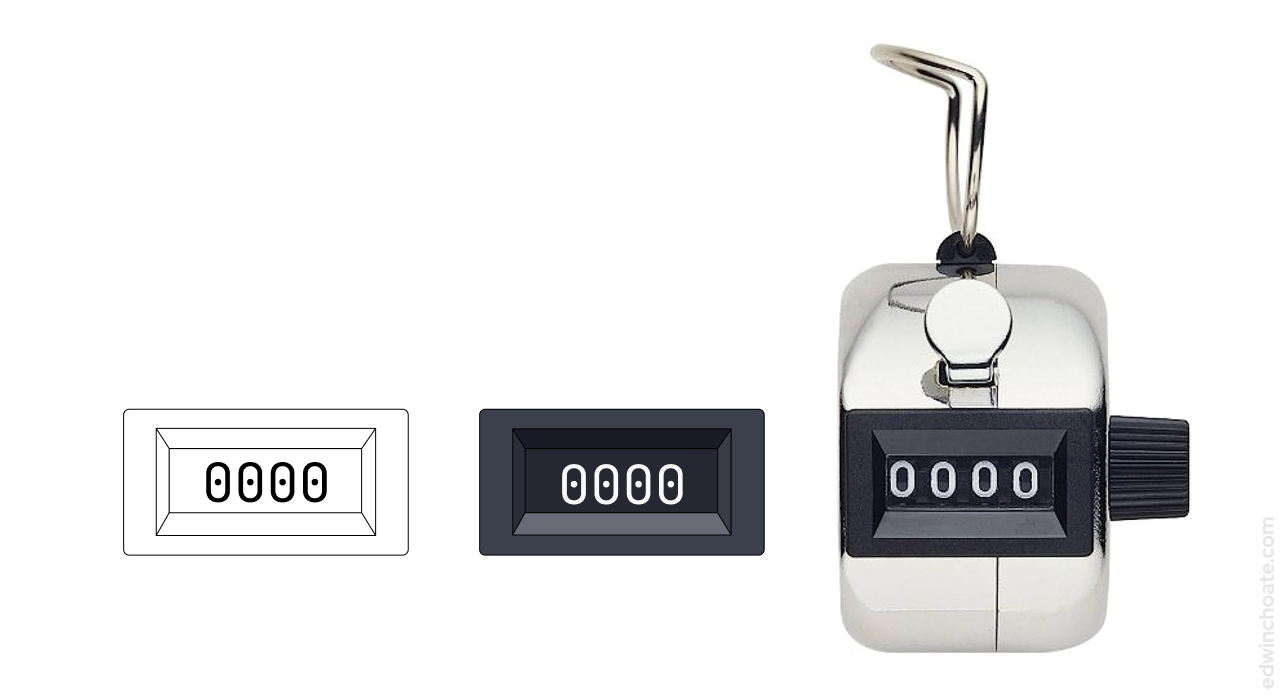
Was this necessary? Of course not, but I wanted to learn how to take a custom vector graphic, design it, and put it into a working application. This also served as a way to learn to how put text into a graphic, text that’s not embedded in the SVG but rather font text that can be updated as the user interacts with the app.
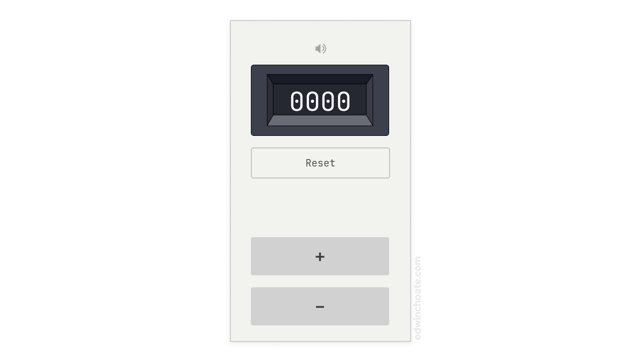
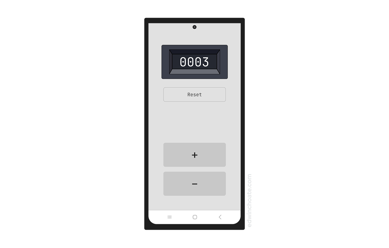
It was straightforward and simple to design an interface for this problem. I placed the plus and minus buttons at the bottom of the screen for ergonomic reasons: they are much closer to the user’s thumb, and these buttons are ones that are frequently pressed. I made the buttons large to make it easier to press them (large target area).
I placed the reset button near the top of the screen which accomplished two things simultaneously:
- By placing the reset button far away from the +/- buttons, it mitigates the risk of consequential slips (i.e. the user trying to press the + button and accidentally pressing the reset button).
- By placing the reset button in close proximity to the count, it subtly reinforces what the reset button does, it resets the count.
Building the App
I built the app with .NET MAUI. I was considering publishing it to both iOS and Android app stores, however, without another reason to have an Apple developer account, I couldn’t justify paying $100/year to publish this simple app. So I opted to just publish the Android app to Google Play.
Handling Input
The click handlers for the buttons were straightforwardly simple to implement as well, another byproduct of the simplicity of the app overall.
private void OnIncrementClicked(object sender, EventArgs e)
{
    if (count < 9999)
        count++;
    else
        count = 0;
    ButtonPressFeedback();
}

private void OnDecrementClicked(object sender, EventArgs e)
{
    if (count >= 1)
        count--;
    ButtonPressFeedback();
}

private void OnResetClicked(object sender, EventArgs e)
{
    count = 0;
    ButtonPressFeedback();
}

private void ButtonPressFeedback()
{
    HapticFeedback.Default.Perform(HapticFeedbackType.LongPress);
    countLabel.Text = count.ToString().PadLeft(4, '0');
    SemanticScreenReader.Announce(count.ToString());
}
Color System
I discovered that .NET MAUI has a nice color system similar to Sass/CSS variables or color variables in Figma.
You set the values in /Resources/Styles/Colors.xaml:
<Color x:Key="Primary">#3C3F4C</Color>
<Color x:Key="Secondary">#191B26</Color>
<Color x:Key="Tertiary">#252731</Color>
<Color x:Key="White">White</Color>
<Color x:Key="Black">Black</Color>
<Color x:Key="Gray100">#E1E1E1</Color>
<Color x:Key="Gray200">#C8C8C8</Color>
<Color x:Key="Gray300">#ACACAC</Color>
...
and then you reference those values in your views. In MainPage.xaml:
<Button x:Name="resetBtn"
    Text="Reset"
    TextColor="{StaticResource Gray600}"
    BackgroundColor="{StaticResource Gray100}"
    BorderColor="{StaticResource Gray300}" />
Layout
And then to get the layout to resize properly I used the StackLayout and AbsoluteLayout classes in combination.
In MainPage.xaml:
    <StackLayout Padding="30, 90, 30, 60" Spacing="35">
        <StackLayout HorizontalOptions="Center">
            <AbsoluteLayout>
                <Label x:Name="countLabel"
                        Text="0000"
                        AbsoluteLayout.LayoutBounds="74, 36"
                        ZIndex="1"
                        HorizontalTextAlignment="Center" />
                <Image ZIndex="0" Source="frame.png" />
            </AbsoluteLayout>
        </StackLayout>
        <Button x:Name="resetBtn"
                Text="Reset"
                WidthRequest="260"
                HeightRequest="60" />
        <StackLayout VerticalOptions="FillAndExpand"></StackLayout>
        <StackLayout Spacing="20">
            <Button x:Name="incrementBtn"
                Text="+"
                WidthRequest="260"
                HeightRequest="100" />
            <Button x:Name="decrementBtn"
                Text="–"
                WidthRequest="260"
                HeightRequest="100" />
        </StackLayout>
    </StackLayout>
I used AbsoluteLayout to position the counter text precisely over the right spot in the SVG graphic, and then StackLayout took care of the horizontal centering of everything on the page as well as expanding the middle section of the page such that the +/- buttons are at the bottom of the screen.
Publishing the App
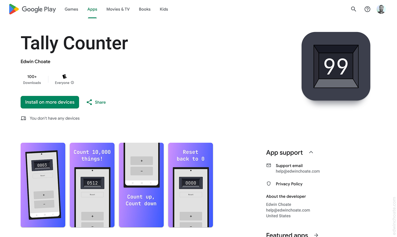
One of the main reasons I wanted to do this small project was to learn what it’s like to publish an app to one of the app stores. I chose Google Play just because it is the free option.
Through the process of publishing the app, I learned:
- You must have a customer support email address
- How to write a privacy policy for an app
- Man, do they make you fill out a lot of paperwork!
- How to cut a release build and sign it
- Managing target frameworks and versioning with release builds
I hadn’t done much of that before so that was interesting to learn.
Conclusion
It was fun to take every step - from idea to published app - to see what the process entails. This project gave me exposure to .NET MAUI and a more native-app way of building interfaces (as opposed to building web applications), which I found interesting. I’d never packaged an app and deployed it to the app store before, so this project elucidated that for me. I’m glad I did this project because it gave me greater perspective.
Let's Get in Touch
Email me at hello@edwinchoate.com, or connect with me on LinkedIn.
Read More
Only got a minute? Check out the showcase.