
SpeedDialer AI
Summary: I was the team's designer for a 24-hour company hackathon. Our team of eight imagined how we might improve the lives of internal sales reps by using AI to more intelligently process customer call data.
Context: A Company Hackathon
This project was created for an optional company hackathon. The prompt for the hackathon was open-ended, allowing for creativity and innovation. The central theme of the hackathon was collaboration. We were tasked with creating a collaboration tool of some kind. What exactly that looked like was totally up to us. It was not prescribed in the prompt to use AI for our project; that’s something we opted in to.
What is a hackathon? Article: wikipedia.org/wiki/Hackathon
For this hackathon, we had 24 hours to come up with our solution, build it, and put together the presentation.
Figuring Out The Problem To Solve
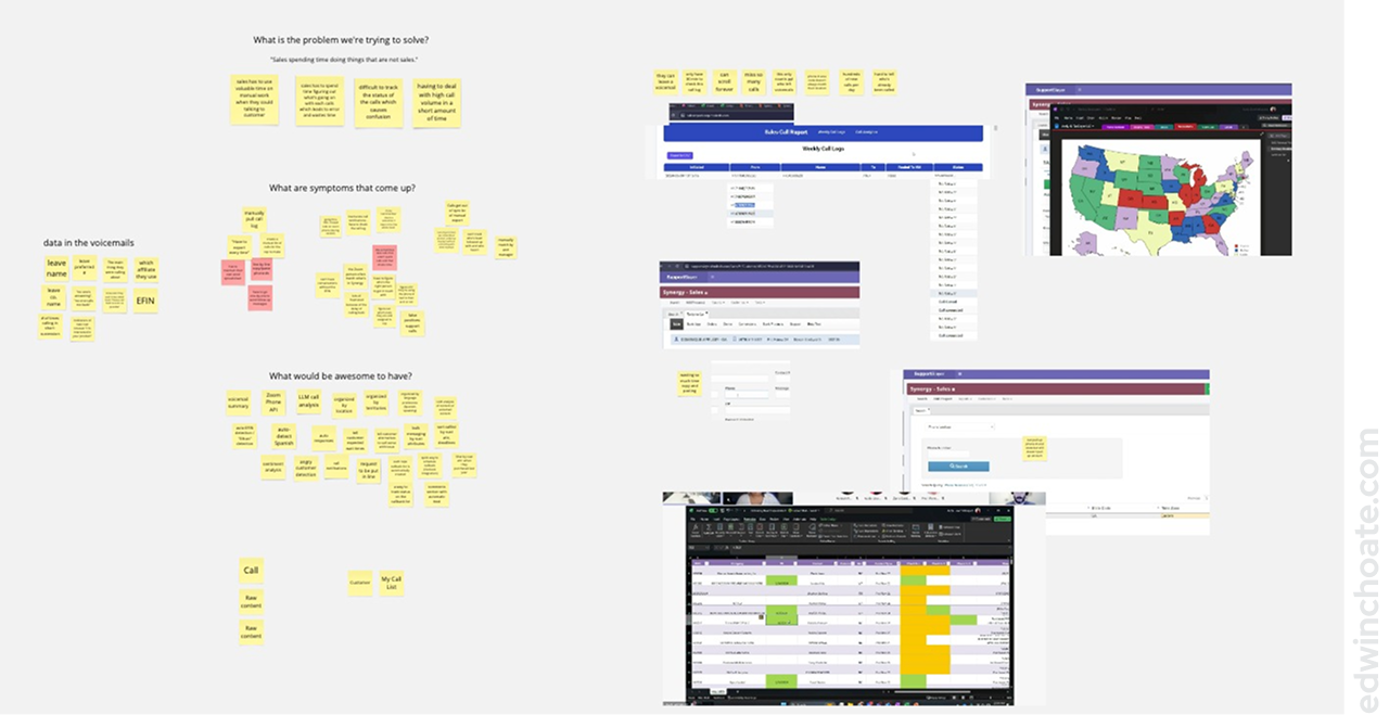
I was the resident designer on the hackathon team. I took to facilitating the brainstorming. I screenshared a Miro board to the team and we talked through ideas as I noted the team’s ideas on sticky notes on the board. I kept the group focused on what problems we could solve rather than talking about solutions.
We went around the room throwing out ideas, and I wrote down everyone’s ideas, no matter how silly, and no matter who they came from. I had the group continue to brainstorm a little further even after they’d already thought of some ideas they were excited about. As the team discussion progressed, it became increasingly obvious that there was a particular problem the team was motivated to solve: the sales team was having problems with the sheer volume of customer calls, and they wanted a way to work together (collaborate) to divide and conquer.
The target user for this application was internal sales reps, and we had two of them on our hackathon team. This gave us an advantage in the hackathon: fast access to accurate, rich user data.
We arrived at four main problems we wanted to solve:
When sales was managing their customer calls, they were having to spend…
- Time on manual work
- Time gathering context (What’s going on with that call)
- Energy figuring out call status (Is it resolved?)
- Time on high call volume
To dig in a little deeper, I posed a couple questions to the group to understand more detail about the problems:
- What are some symptoms that come up?
- What would be awesome to have?
(I wouldn’t ordinarily use these kinds of leading questions when conducting user research, but these prompts were intended to speed us along.)
Because we just had one day to come up with a solution, I saw to it that it was crucial to get started on a solution as soon as we could. Normally, rushing to a solution isn’t a good way to go, but we simply didn’t have time to do otherwise.
Jumping Right In (No Time to Waste)
Because this was a hackathon and we had to deliver something in one day, I broke a rule I normally abide by: understanding the problem before jumping to conclusions. (To be fair, we did take about an hour to talk about the problem as a team.) This was about as much time as we could afford to spend on defining the problem.
Once we had an idea of what problem we wanted to solve, I quickly got to work on the design while our developers worked on the prototype in parallel. I worked on design ideas as they came to me, jumping straight from concept to high fidelity UI designs for the sake of time.
The team agreed to meet back to go over what we’d come up with by a certain time that evening. From there, we’d discuss the presentation, divvy up the work, and work on our parts of the presentation overnight.
Design Concepts
There wasn’t time for deliberation, and there wasn’t time for iteration so I went directly from ideas to high fidelity mockups. I decided not to make a prototype and instead just talked through static screen designs.
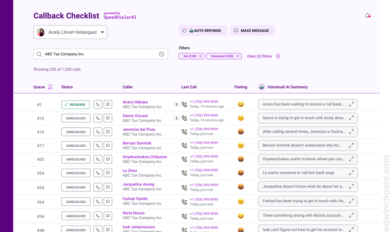
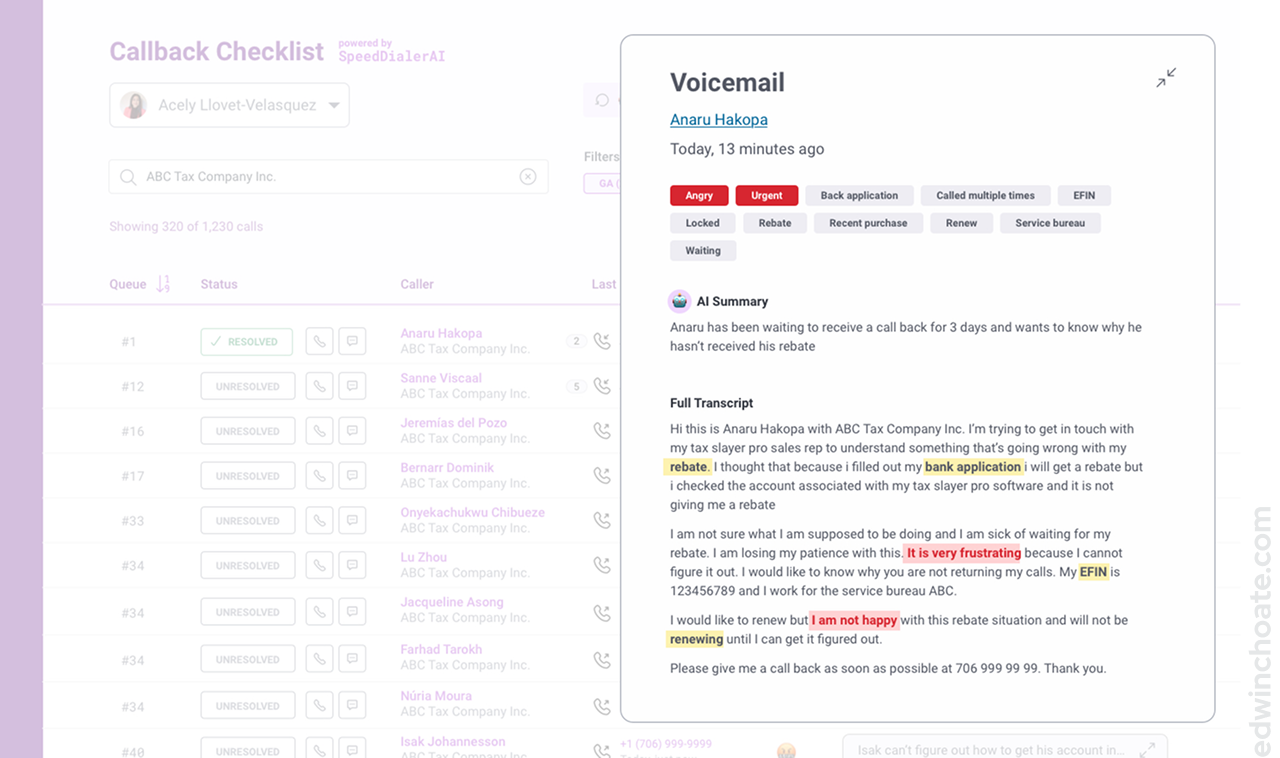
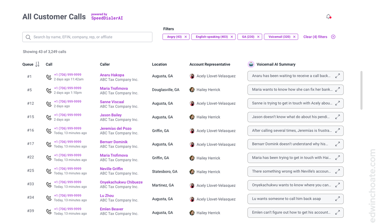
I imagined what kind of data the sales reps might like to see in this view. I sought to make this view data-rich with information that might be meaningful to the reps, as well as actionable.
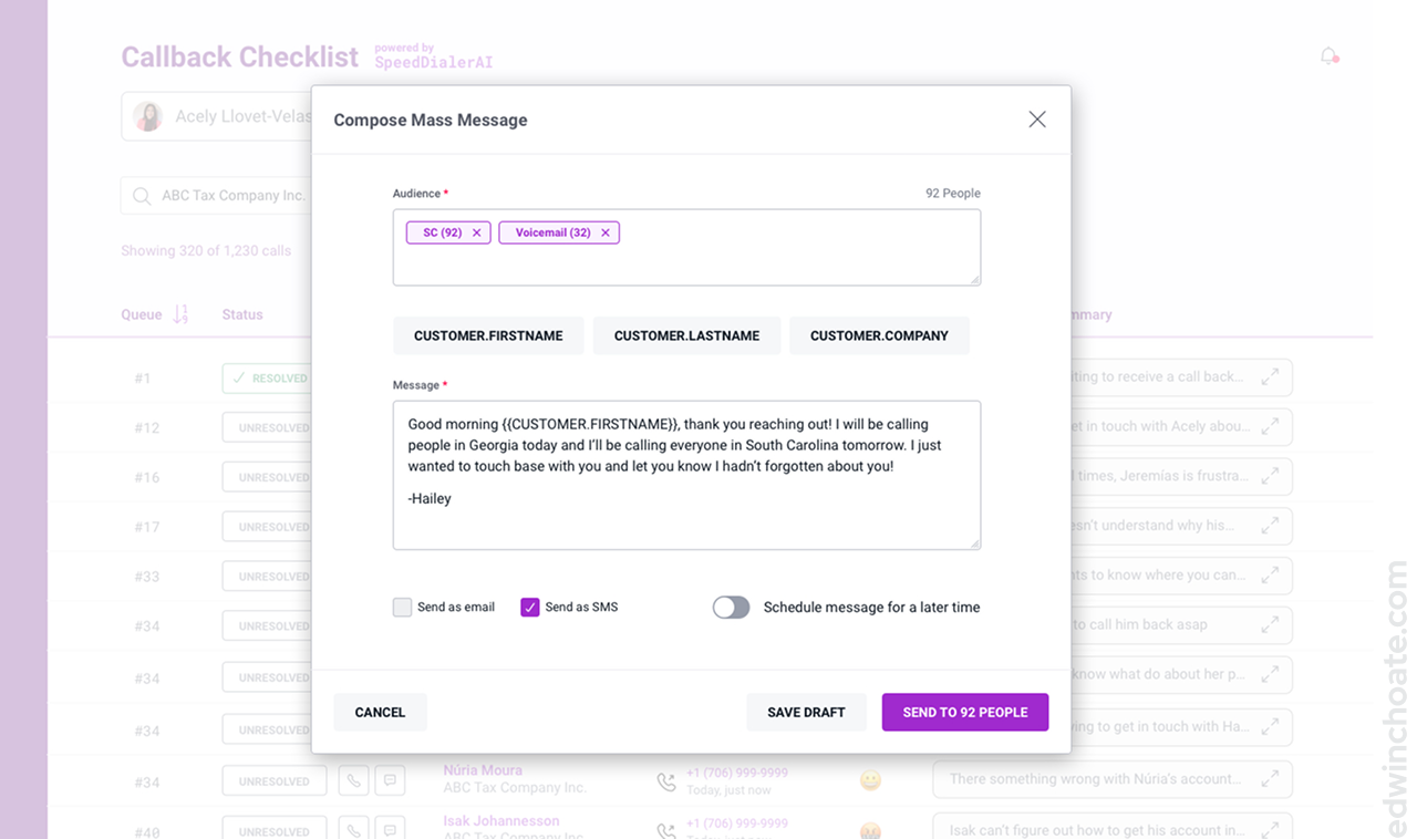
There are several features on this page that use AI:
- Auto Response (more on that below)
- Mass Message(more below)
- Filters - these are intended to be populated by AI parsing the data, coming up with “filter ideas” for the user
- Feeling - the feeling column would be populated by the AI parsing the call transcript using LLMs and coming to a judgement on how the caller is feeling. By using emoji for the values in this column, the idea scales out in precision to all the emotions that can be captured by emoji, which is a lot.
- AI Voicemail Summary - this would be populated by the raw call transcript, and AI would parse it to make it quicker to read through the voicemail (more on that below)
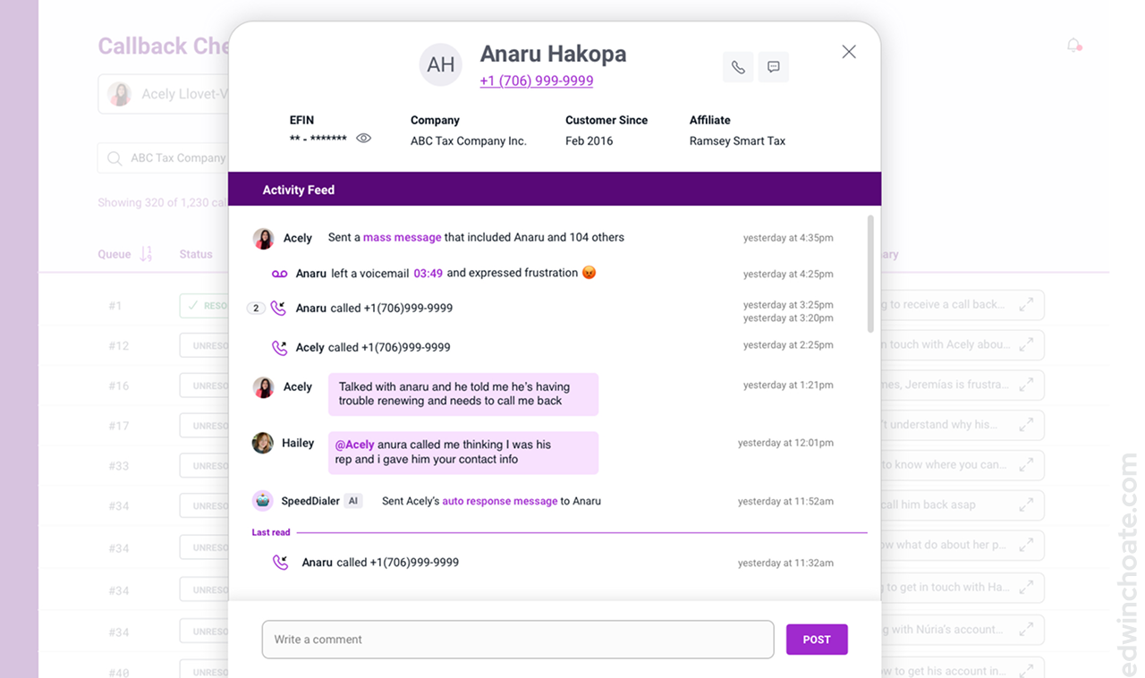
By personifying the AI, it makes it intuitive that the AI would be a participant in the conversation. (I just used the robot emoji instead of making a custom graphic because we were limited on time.) What makes this view easy to follow is the fact that the variety of events (calls, chat messages, mass messages, AI features, automatica triggers, etc.) are all reconciled on one timeline.
Another big picture of solving the problem was simplifying cutting down on manual efforts. I thought: what if there was a way to perform the same task for many many customers?
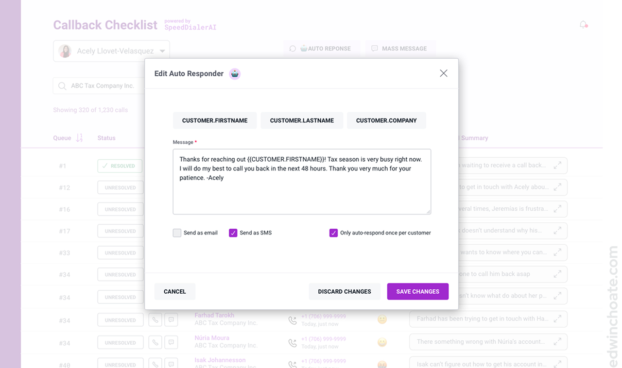
The idea behind the Auto Response concept was that it’d function a lot like an out-of-office message. I incorporated the robot icon here, to convey the presence of automation in this feature. The robot icon shows up throughout the experience to denote automation and/or AI.
This was probably the feature that I got most excited about personally because it combined the concept of AI-driven filters (born out of the calls dataset) with the concept of a human-written message. I particularly like the idea that AI might free up users to focus on the human element of their work more, not less.
“User” Feedback
“We would love this if it was real.”
A big advantage of having representative users on our hackathon team was that once the design concepts were ready, I could get fast realistic feedback from them. They were enthusiastic when they saw the designs. I’m sure there was a bit of team bias going on here, but I took it as a good omen.
Final Presentation
My Role
I was the sole designer on the hackathon team of eight people. During this project, I wore these hats:
- Facilitator
- UX designer
- UI designer
- User researcher (in theory)
- Leader
Conclusion
I really enjoyed being a part of this hackathon. It was a great way to meet people throughout the company and work with people you don’t normally work with. Ultimately, our team placed 2nd (out of five teams). We’ll have to get ‘em next time! I like that my company does an annual hackathon; it’s well worth the time put into it!
Let's Get in Touch
Email me at hello@edwinchoate.com, or connect with me on LinkedIn.
Read More
Only got a minute? Check out the showcase.