
Sketchy Wireframe System
Summary: As a practicing UX designer, there are times when I need to make digital sketches that intentionally look like rough ideas rather than polished, finished things. I decided to make my own tool to do that. Sketchy is a simple, extendable wireframe library that I created to produce digital sketches for my day job.
Free Download
You can download Sketchy for free if you’d like. As of this writing, it’s only available for Sketch.
The Problem I Was Solving
You might be thinking: there are a ton of low-fidelity wireframe libraries out there… why not download one of those? That was my first thought too. In actuality, I struggled to find a wireframe kit that worked well for me.
A wireframe kit needs to help you work quickly, because wireframes are supposed to be illustrative and are meant to be thrown away. Any time unnecessarily spent on the visual appearance of a wireframe is time wasted.
I needed:
- Something that would allow me to create wireframes quickly.
- Something that would help me make artifacts that look like rough sketches, not finished designs.
- A digital alternative to pencil and paper.
After becoming frustrated with the free low-fidelity wireframing resources online, I decided to take matters into my own hands and make the thing I wanted.
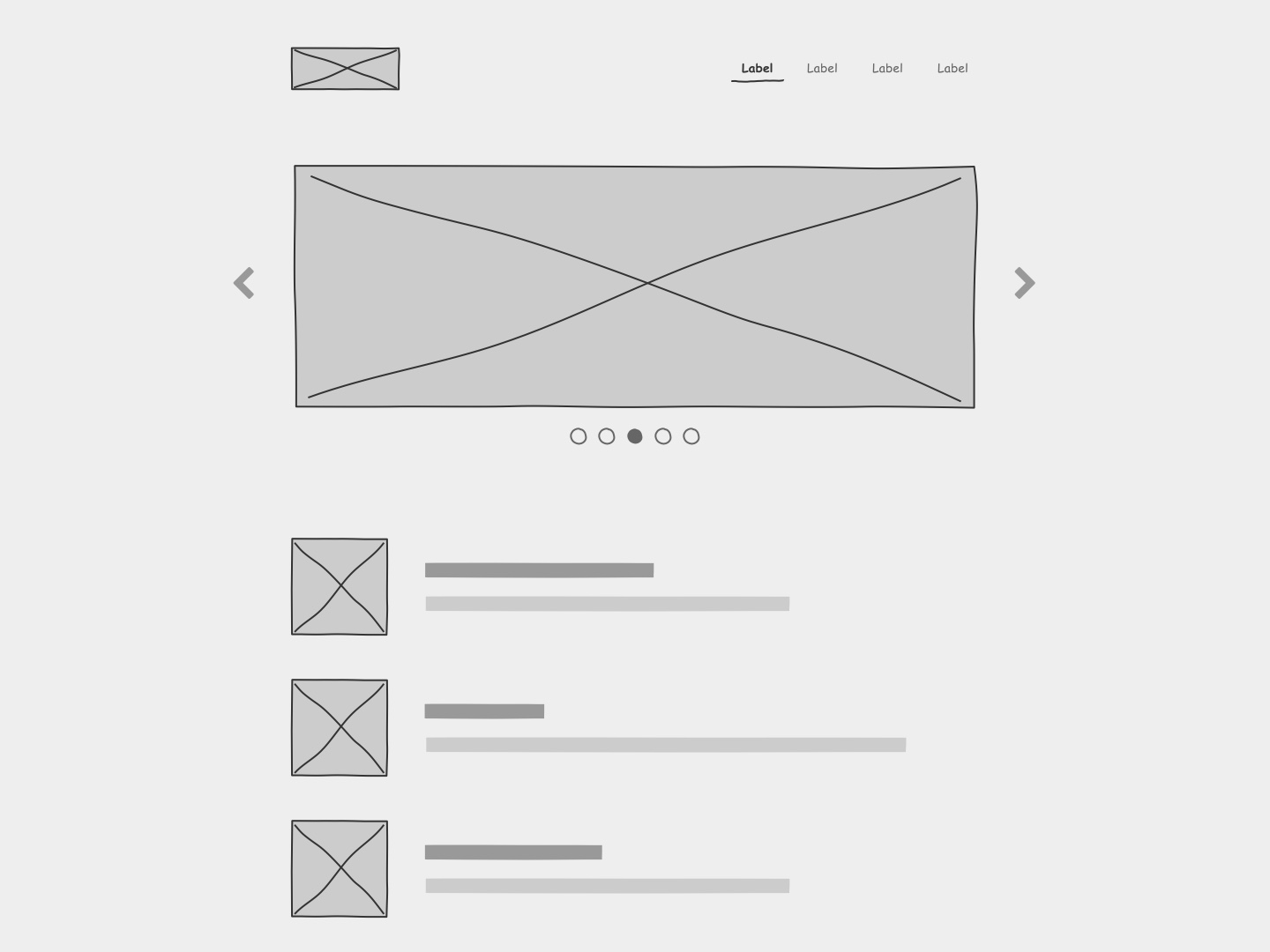
Benefits of Digital Sketching
Before I became a remote worker, I used to sketch my nascent ideas using sharpie and paper. I liked the way it forced me to think about just the idea. Once I became a remote worker, pencil and paper sketching became less effective, because it’s difficult to share a hand-drawn sketch remotely. While I could take a picture with my phone, Airdrop it to myself, and then send it to co-workers… this becomes too cumbersome when attempting to share several ideas.
I also noticed a few more benefits of digital sketching:
Copy/Paste – When you draw everything by hand, you find yourself re-drawing the same shape over and over. It’s a huge time-saver to be able to copy/paste something you’ve already sketched. Ctrl-Z – if you make a mistake on paper, you have to live with it or start over. It is a game-changer to be able to undo something quickly and take the idea in a different direction. Live-sketching over Zoom – if you can work quickly enough, you can sketch out ideas in real time as you’re having a conversation with someone over Zoom. This is the closest thing I’ve found to remote whiteboarding sessions.
Why the Hand-Drawn Look and Feel?
One of the main purposes of Sketchy is to solve a specific problem I was having at work: when I’d show a high-fidelity design artifact to a stakeholder, they would interpret it as finished work even though, in actuality, it was just a start. By making artifacts look like a hand-drawn sketch, it reinforces that the artifact represents an idea that can be changed or thrown away. There’s also something nice about the human touch of a hand-drawn aesthetic. Geometric boxes and arrows with hard lines come across as comparatively more robotic.
Keeping Things Simple
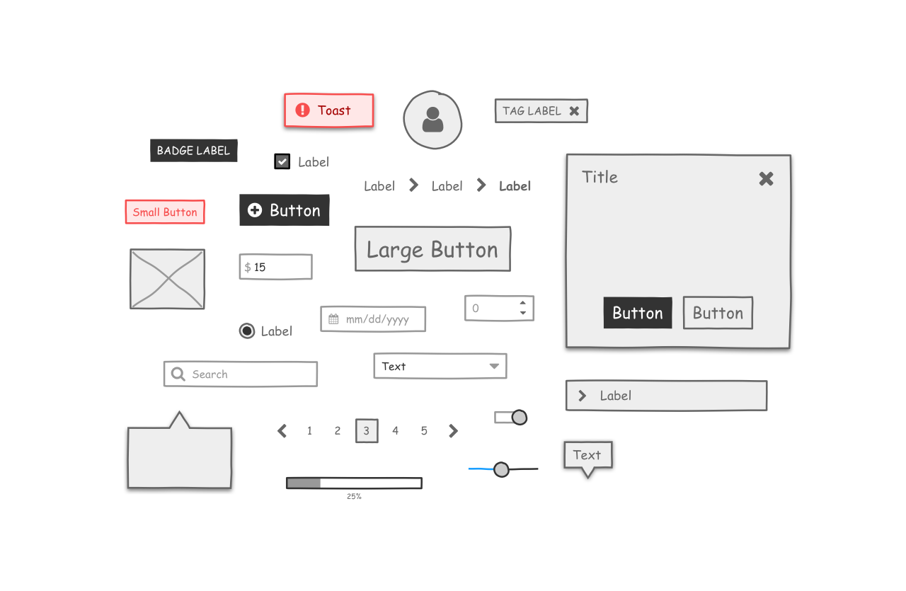
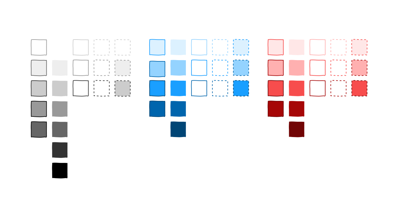
Sometimes it’s difficult to resist the temptation to make a button’s corner radius perfect or the temptation to make the font weight of a label just right. Nevertheless, time unnecessarily spent on the visual appearance of a wireframe is time wasted. By limiting the options available, Sketchy acts as a forcing function that encourages the user to focus on only the necessary decisions.
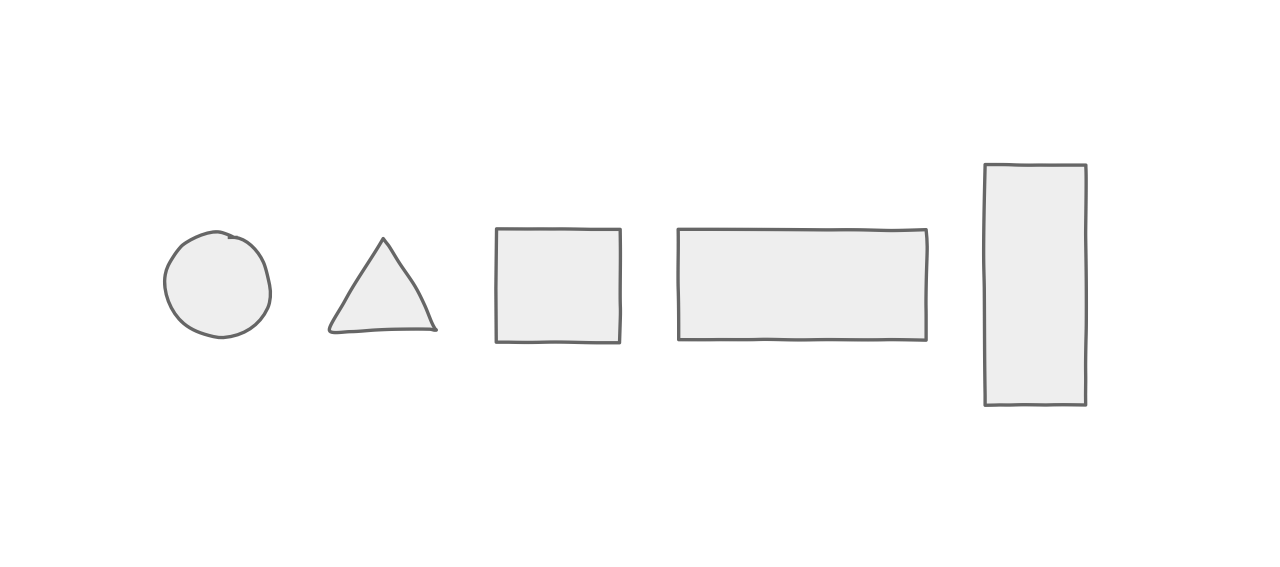
One of the main problems I found with other free wireframe libraries online is that they try to do too much and in the wrong areas. I don’t need an overly-specific card element that has one picture, a title, and a subtitle, but I do need all the buttons to support smart layout. In creating Sketchy, I resolved to limit the components I included in the library to just what’s necessary for most wireframes, and to implement them well. If I can’t quickly drop a component into a wireframe and use it, then the library isn’t doing its job.
The components I decided to include in the library were:
- Accordion
- Alert
- Badge
- Breadcrumbs
- Dialogs
- Drawer
- Icon
- Inputs
- Checkbox
- Date
- Label
- Money
- Number
- Radio
- Search
- Select
- Text Area
- Text Field
- Lists
- Modals
- Pagination
- Popover
- Progress Bar
- Progress Indicator
- Shapes
- Circle
- Triangle
- Rectangle
- Sliders
- Stepper
- Switch
- Tabs
- Tag
- Tooltip
Freedom in Constraint
Perhaps the most important consequence of the decision to keep the library as simple as possible is that it makes it more flexible. It’s easier to extend the system when you think about each component as a thing that’s composed of basic shapes.
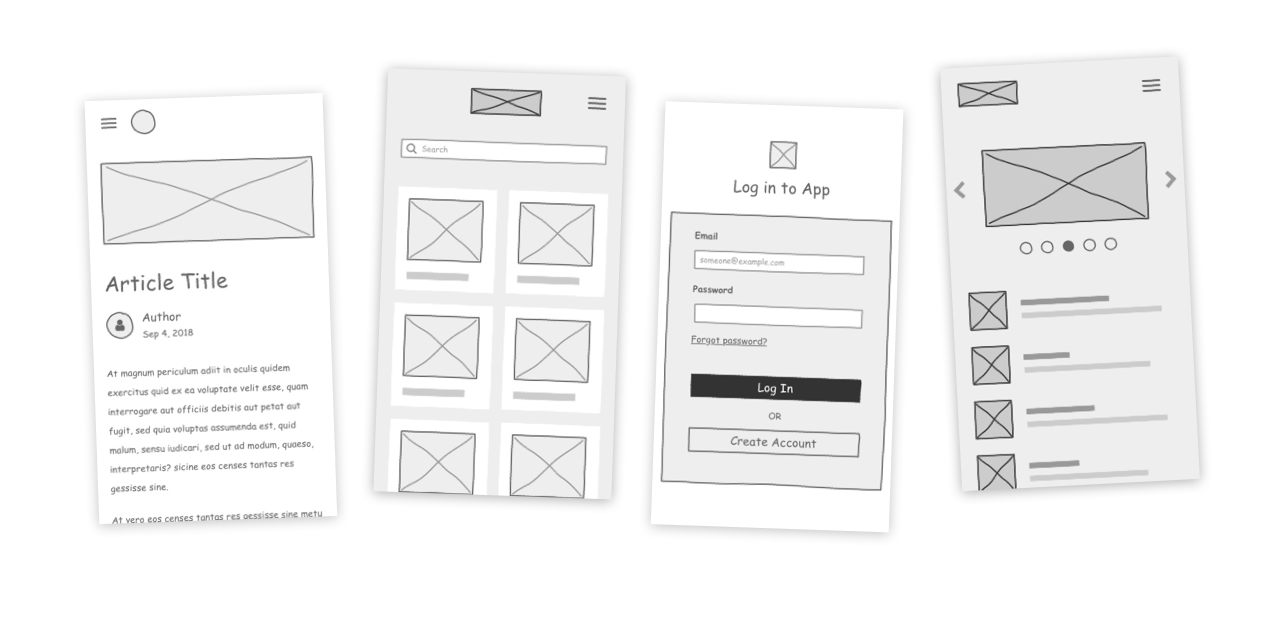
The way that you build any one component in the system is the same as the way you build every component in the system. Therein lies the power of the system. Ultimately, this makes the library faster to use – one of the main goals of the project. This is essentially Hick’s Law at work. With fewer options, it takes less time to come to a decision.
Using Sketchy in My Day Job
The great thing about using your own product is that it becomes obvious to you what its issues are. I use Sketchy in my day job regularly and I can confidently say that it does what it was intended to do: enable me to quickly sketch low-fidelity wireframes without getting bogged down in small design details. To my surprise, I haven’t needed to change Sketchy very much after over a year of using it!
Conclusion
When you’re having a hard time finding the thing you’re looking for, sometimes you just have to make it yourself. That was the case for me with wireframe libraries, and I’m glad I went this route. Once I became a remote worker, pencil and paper sketching was no longer effective for me. I needed a tool that would help me make digital wireframes with all the simplicity of pencil and paper. Sketchy has a hand-drawn look and feel to make artifacts look like sketches, and it keeps things as simple as possible. Sketchy has solved the problem I set out to solve, and I’ve continued to use it regularly in my day job ever since.
Let's Get in Touch
Email me at hello@edwinchoate.com, or connect with me on LinkedIn.
Read More
Only got a minute? Check out the showcase.