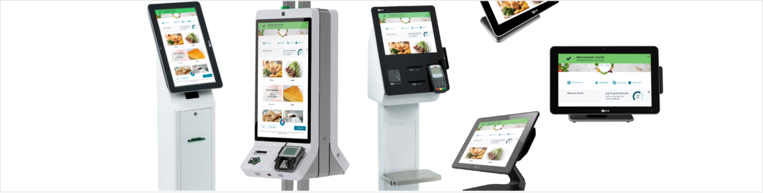
Self-Order Kiosk
Summary: As a UX architect on a team of five UXers, I re-architected the user flow of the NCR Self-Serve Kiosk. I prototyped iteratively based on observations from NCR Corporation’s in-house food court. My team and I were able to significantly improve the usability of the product as it was brought into the market.
The Problem We Were Solving
NCR’s Self-Serve Kiosk exists to enable restaurant customers to order food in-store at a restaurant without having to wait in line to order from a cashier. People were having a difficult time navigating the kiosk’s user interface. They were getting frustrated, abandoning their orders, and walking away.
The kiosk needed a redesign that would improve usability in a significant way, and this needed to be done quickly. My team was brought in to fix this problem. We knew going into it that we would need to support the existing functionality that the kiosk provided.
User Personas and Journey Maps
When we observed users interacting with the kiosk, three types of user behaviors emerged which led to three distinct personas. The personas varied across two main traits:
- Pace – how quickly does a user expect to be able to navigate through the user interface?
- Tech savviness – how comfortable is the user with kiosks and other relevant touch screen modalities?
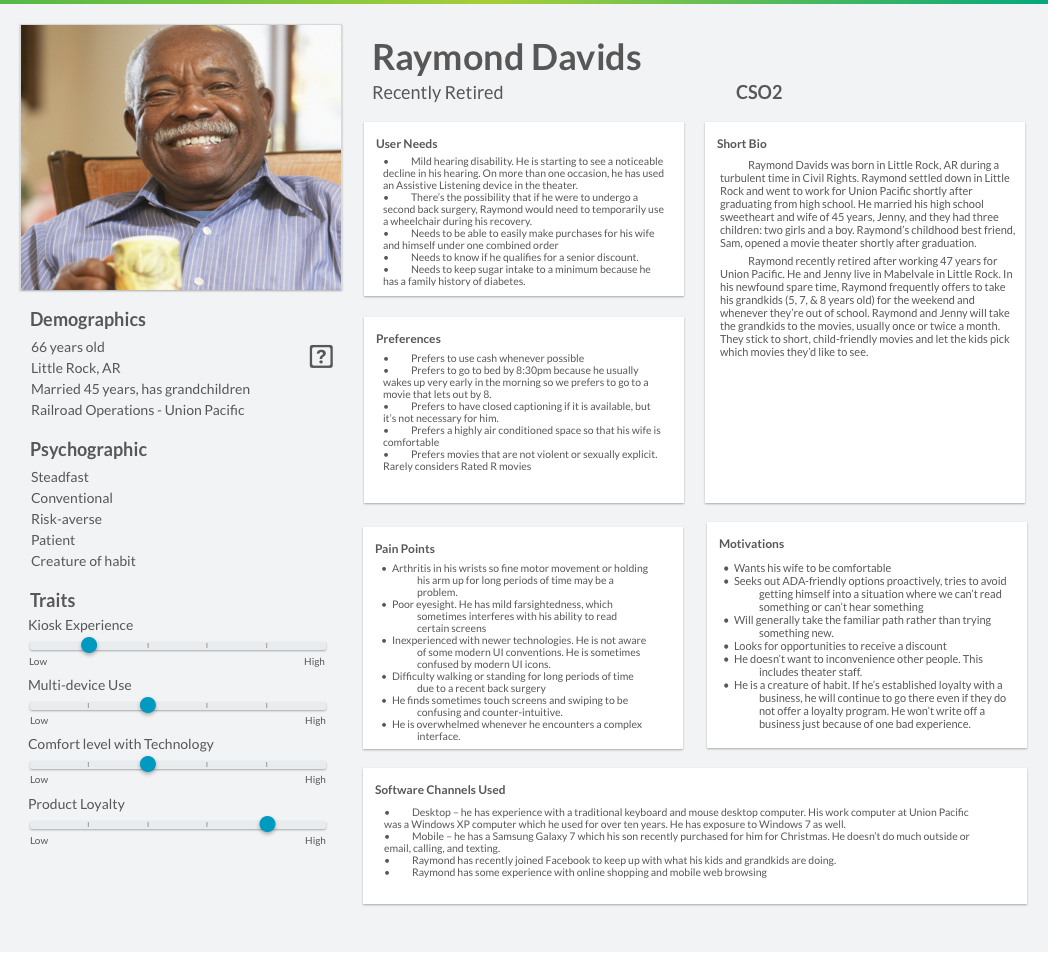
The Personas
- Brian – a tech savvy user who’s focused on budget
- Raymond – a kiosk novice user who moves at a slower pace
- Karen – a moderately tech savvy user who moves at a fast pace
(I wrote the Raymond persona and my teammates wrote the other two.)</p>
A Stroke of Good Luck: Our Own, In-House Test Bed
We were fortunate to have an ideal user testing setup: the product was in use in our own office. NCR installed several kiosks in its food court. Given this ripe opportunity, our team was able to perform user testing during mealtimes in a highly realistic context. We performed user observations on a daily basis (usually at lunch) and used the insights we gleaned in the next iterations of our designs.
Market Analysis: Kiosk Best-Practices
In an effort to understand kiosk best practices and conventions, I worked with another UX designer on my team to analyze a variety of kiosks in the market. We found patterns across the kiosk products which we used to establish a set of kiosk best-practices to use in our application.
I dissected kiosk user interfaces such as:
- Best Buy Express
- Disney Fastpass
- Ikea
- Home Depot Self-Checkout
- Redbox
- Subway
- Panera
- Jack in the Box
- and a few others
Then, I broke down these kiosks’ user flows into smaller chunks of the user experience so that we could better analyze each interaction.
I looked at how these kiosks:
- Display information to users
- Display status to users
- Educate users
- Handle loading
- Present options to users
- Provide feedback to users
- Collect data from users
- Summarize orders
- etc.
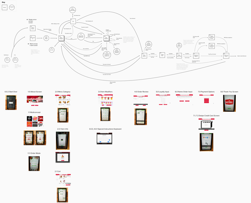
Understanding the Existing User Flow
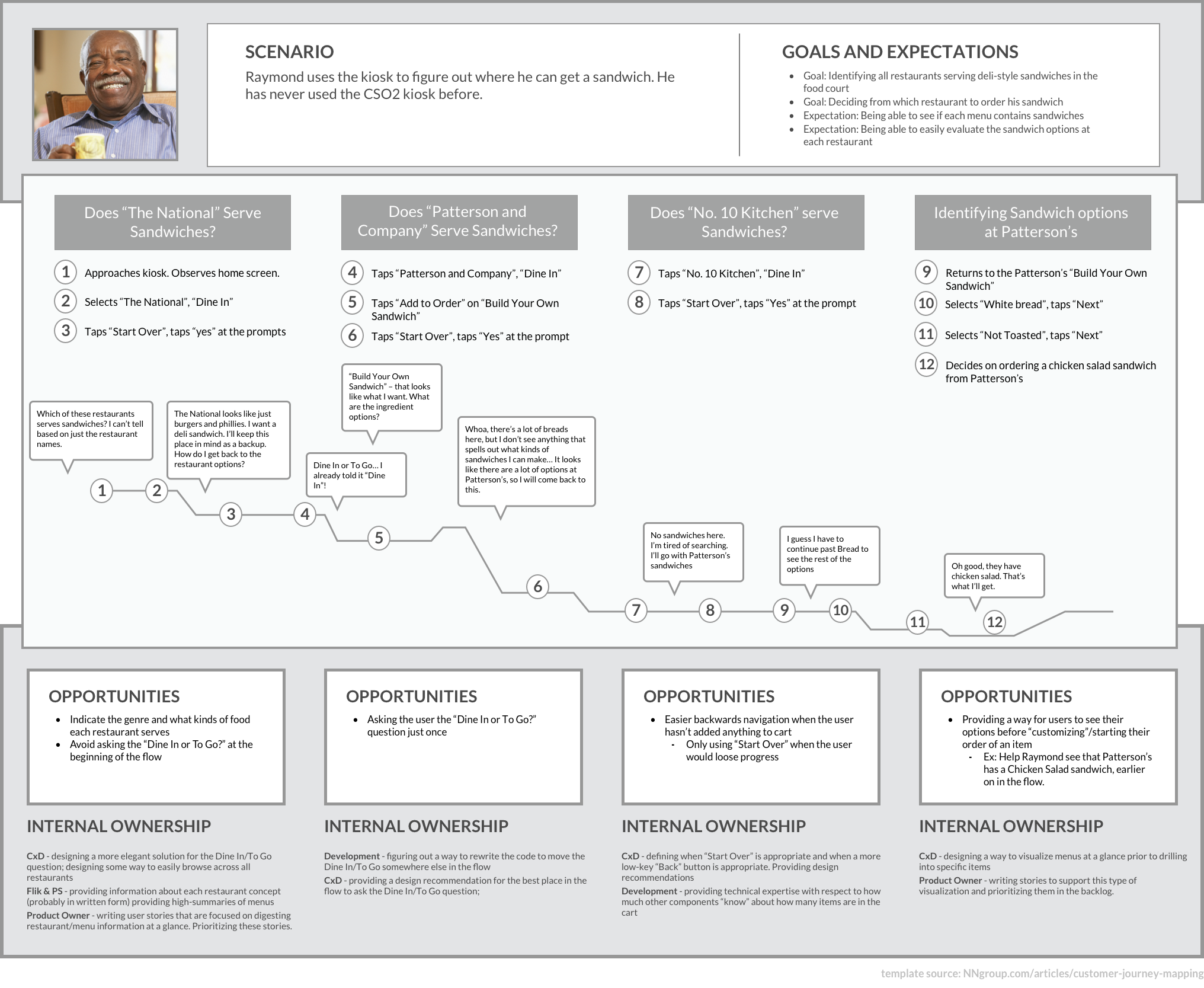
In effort to understand the existing user flow at the start of the project, I broke the flow down into a series of diagrams. This helped my team quickly get on the same page about what the app does and spot opportunities to explore possible improvements right out of the gate.
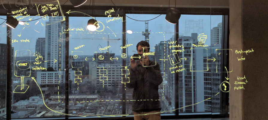
Imagining a Better User Flow
Once I had a good understanding of how the experience of the existing application was architected, I took to the whiteboard and began ideating on alternative user flows. I asked: how might we make the user flow better for each of our personas?
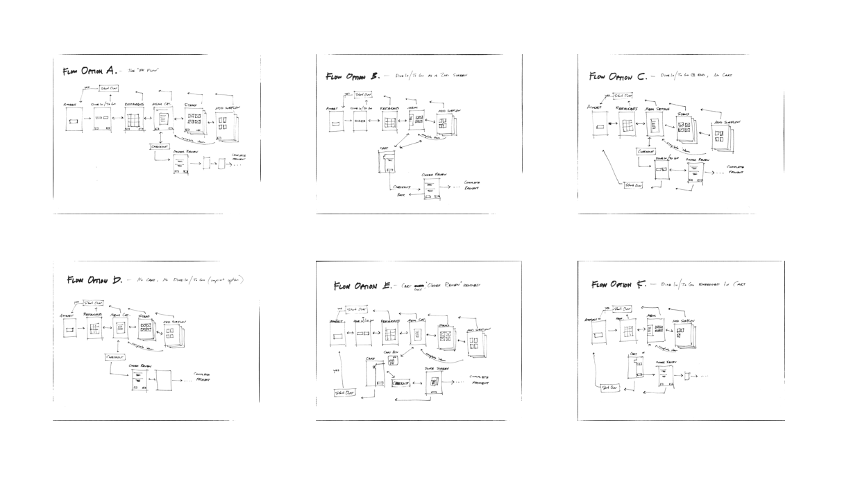
These ideas became the basis for our team’s subsequent iterations and experiments, and were effectively the starting point for the information architecture and navigation of the app.
Pain Point #1: Customizing an Order
Many users struggled to understand how to customize their orders. Removing ketchup or adding cheese… whatever it was, users often wanted to make these kinds of customizations to their orders and the application wasn’t providing an easy way for them to do that. I came up with several different ideas of how to redesign this. Then I prototyped the ideas and my team and I tested them with users. It took several iterations to get this right, but it was well worthwhile since this was one of the aspects of the app that was tripping people up the most.
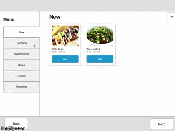
Pain Point #2: Adding Items to the Cart
Users consistently had trouble knowing whether or not something was in their cart. I prototyped several different design alternatives which my team and I then tested. Ultimately, these tests led to us moving where the cart was located on the screen and how we approached animations when a user adds something to his or her cart.

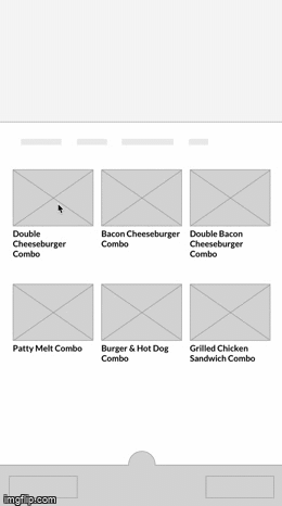
Pain Point #3: Ordering Combo Meals
Users had difficulty navigating through Combo Meals on the kiosk. Combo Meals often bring with them some inherent complexity, so the challenge was to represent all of the ways in which a Combo Meal can and cannot be customized while making it easy for a user to navigate through the process of ordering a Combo Meal.
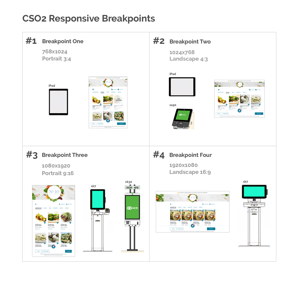
Setting the Strategy for Responsive Design
I established a strategy for how the application was to scale across different screen sizes responsively. I worked in close collaboration with the lead visual designer on the project to ensure that the responsive strategy I came up with would work with the layouts we were planning.
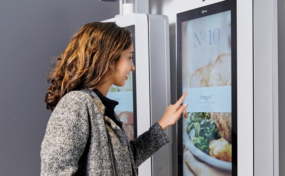
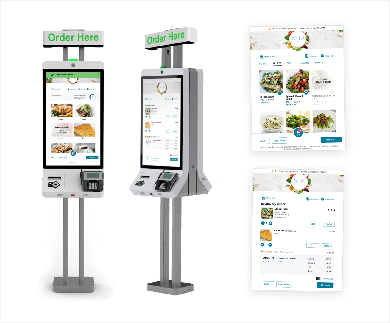
Final Product
My Role
I worked with a team of two UX designers (myself included), two UI designers and one UX research specialist. Because of the size of the team, this enabled us to work in a specialized way. On this project, I focused on UX architecture efforts: UX strategy, creating user flows, creating wireframes, ideation, and producing prototypes for user testing. I did not focus on high-fidelity visual design work on this project.
Conclusion
In the end, my team and I were able to deliver on-time and on-quality. Before we redesign the application, users struggled to complete orders and would often get frustrated by the application. After we delivered our redesign and the product was built, users had a significantly higher rate of completing orders and were observably less frustrated when using the application. Our ability to perform frequent user testing in the real context of use proved to be an invaluable resource to inform design iterations which ultimately improved the user experience.
Let's Get in Touch
Email me at hello@edwinchoate.com, or connect with me on LinkedIn.
Read More
Only got a minute? Check out the showcase.