Roles & Permissions Redesign
Summary: The roles & permissions configuration interface had become unusable after several years. I analyzed the existing interface and redesigned it, re-labeling all of the permissions while validating the changes with stakeholders. Upon launch, we received positive feedback that we'd accomplished exactly what we'd set out to do.
The Problem I Was Trying to Solve
This project was one of those hairy monsters that nobody wanted to touch with a ten-foot pole. Multiple people around the org were aware of the problem: the experience had become a mess. It suffered from years of adding just one more setting, without anybody going in making it organized. People were busy, customers needed a new setting, and they needed it yesterday. This project was about going in, with gloves pulled up to my elbows, and cleaning up the mess.
I came to realize that difficult-to-decipher labels, in combination with the lack of an organizational schema, were making it very difficult for people to understand the interface and feel confident using it.
Performing a UX Audit
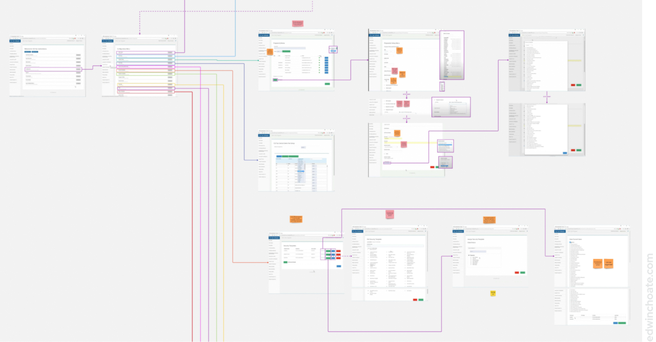
The roles & permissions module was just one part of the broader configuration suite (one of many modules). I started by screenshotting the entire configuration suite and putting it into a Miro board. From there, I took a look at the architecture of how everything was laid out. I saw what others were telling me: that the roles & permissions module in particular was in need of an overhaul.
By time I’d looked over the existing experience, I had formed an intuition of what was wrong with the experience and what needed to be fixed:
- System-driven language
- UI not following best practices or using conventional components
- Insufficient labels
- Meaningless help text
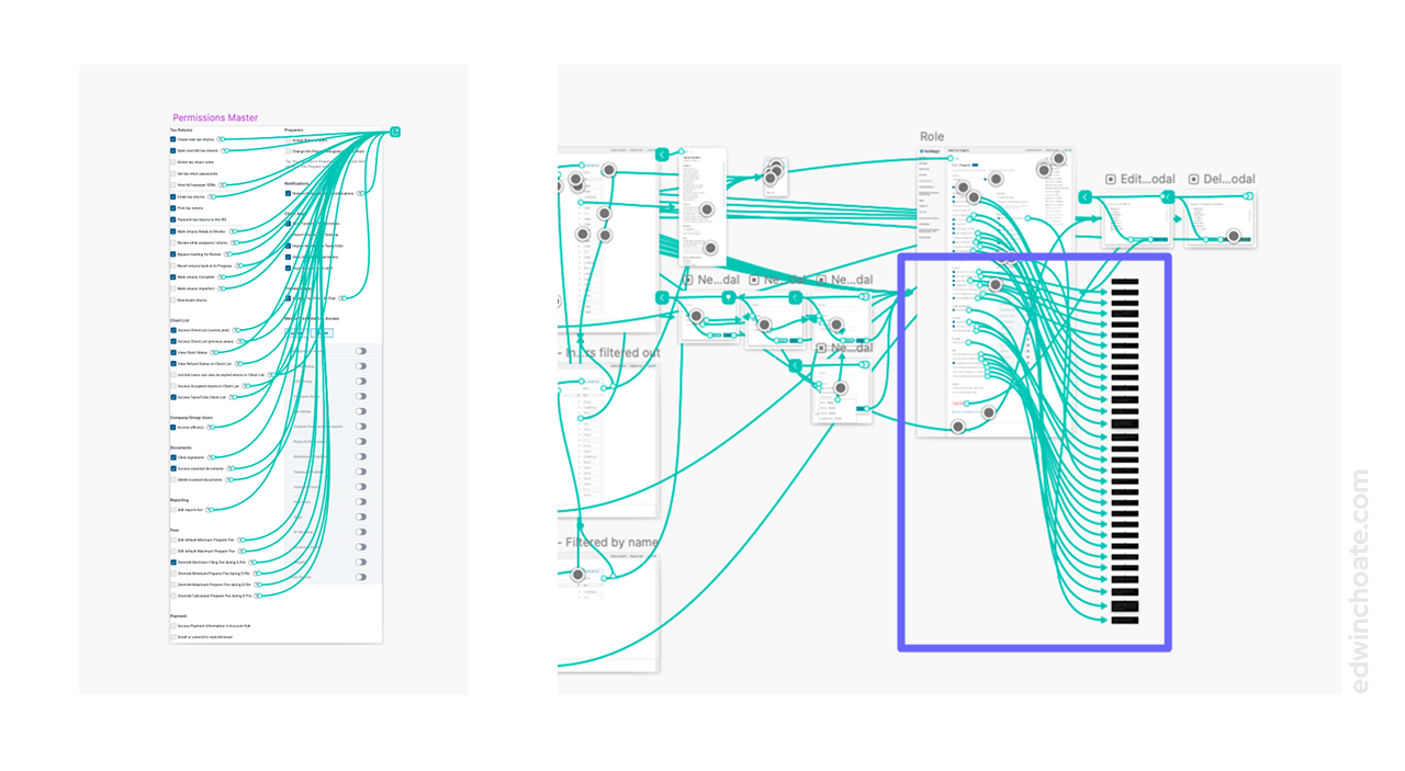
- No organizational schema (no groups) of the permissions
- No easy way to preview your work
- No view showing all of the users and their assigned roles
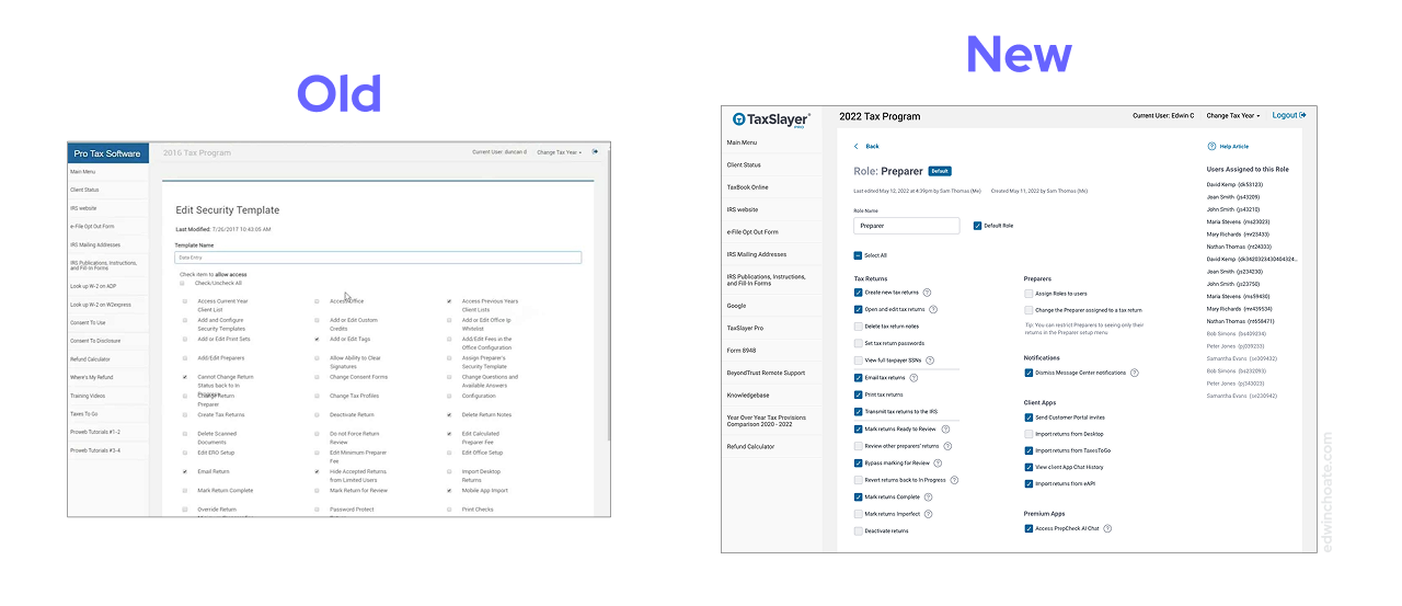
Re-Writing the Labels and Tooltips of Each Permission
A critical part of success in this project was abiding by this self-imposed constraint: absolutely no changes to how the permissions themselves function or what they affect in the system. I only allowed myself to make label changes and user interface changes. All permissions were held equal. Doing it any other way would’ve been completely unmanageable.
There were dozens of permissions and they were vaguely (or misleadingly) labeled. Every permission had a help text, even if it didn’t need it. Many of the help texts were obvious restatements of the label and didn’t need to be there (for instance, if a setting was labeled Start Return, the help text might’ve read “Allows user to start return” or something like that that didn’t add any meaning.)
There was no magic shortcut for this. I simply had to conduct several rounds of stakeholder interviews until I understood what each setting truly did.
Then,
- I re-wrote all of the permissions labels
- I added inline help text (as tooltips) in the UI
- I re-wrote all of the help texts, removing the ones that didn’t add any meaning
- (This created a much stronger signal that help texts would actually provide more info to the user)
- I arranged the permissions into categories, which I then labeled, providing an organizational structure to the information
- (Previously, all of the permissions were just in one big massive group)
Reorganizing the Information in a Single Source of Truth
As I reorganized the information, I used the component in my design file as the single source of truth, updating it every time I edited a label or tooltip.
By using one and only one source of truth for the permissions, their groupings, and their help text tooltips, I was able to preserve sanity, minimize inconsistencies, and socialize to other stakeholders where to go to find the latest changes.
I continued to maintain the prototype artifact even after this project was complete, ensuring it stayed accurate and up-to-date.
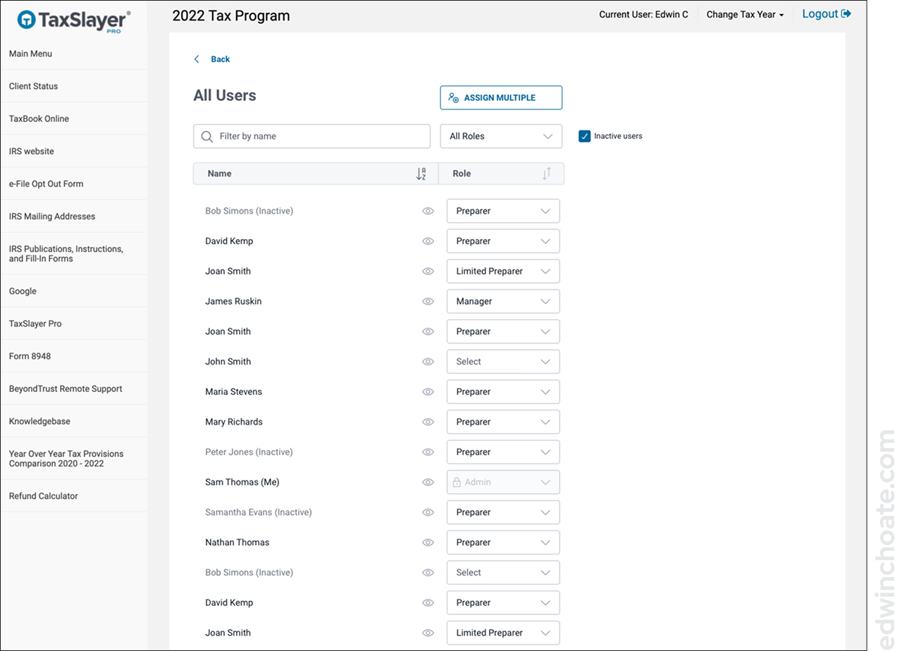
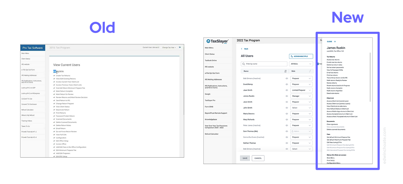
The Missing View: All Users
To my surprise, there was not a way in the previous design to allow you to view a list of all the users and which role they were assigned to. I made this view a primary consideration in the new design, as it’s really the main attraction.
Upgrading the UI - Using Best Practices
There were several places in the experience where there was technically an interface that met the user’s needs, but it didn’t follow ordinary UI conventions. I went through the existing interface and redesigned it, cutting none of the existing functionality and adding in features that would enhance the interface.
I used the components from the design system that I built and actively maintain when building out the prototype for this project (Article: TaxSlayer Pro Design System).
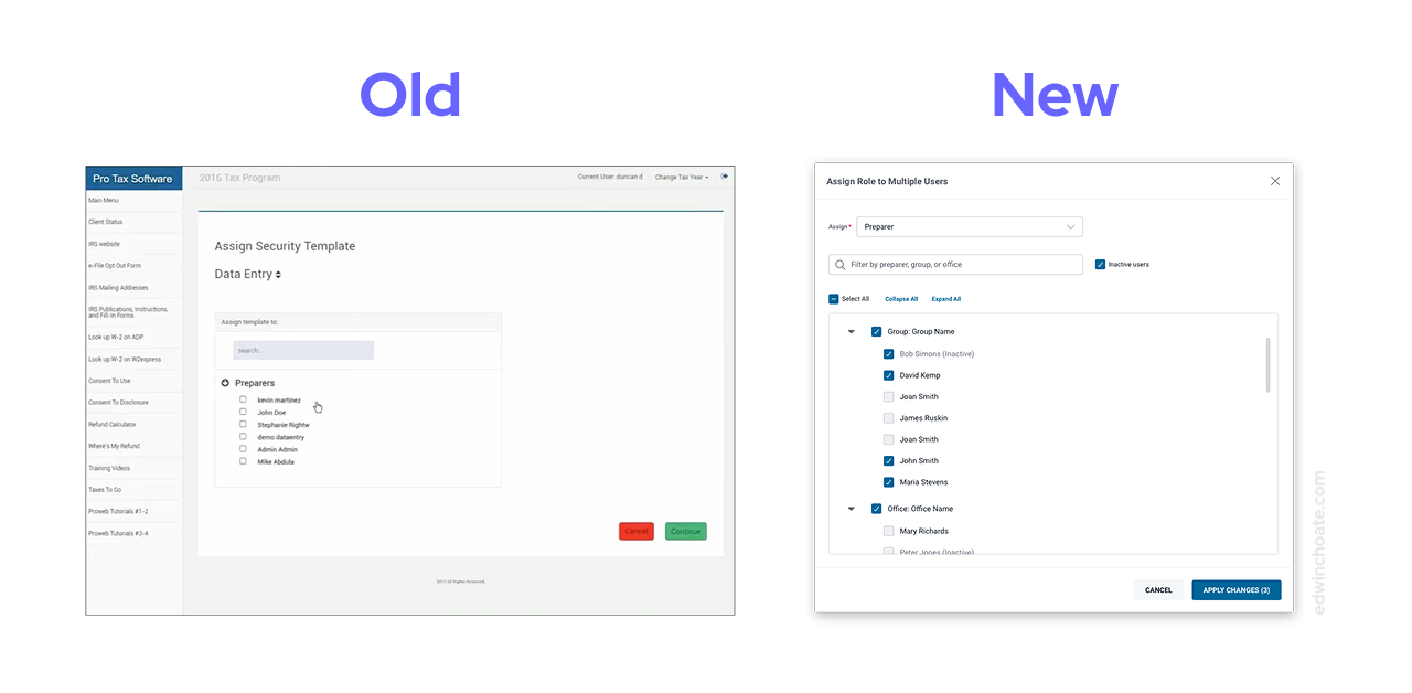
In addition to re-evaluating the on-screen components, it was important to re-evaluate the overall structure of flow of the featureset. Above, I realized we were using a full page when it should’ve been a dialog. Below, I realized we were using a full page when it could’ve been an overlay. By improving the experience at the structural level, it improves the usability of the experience.
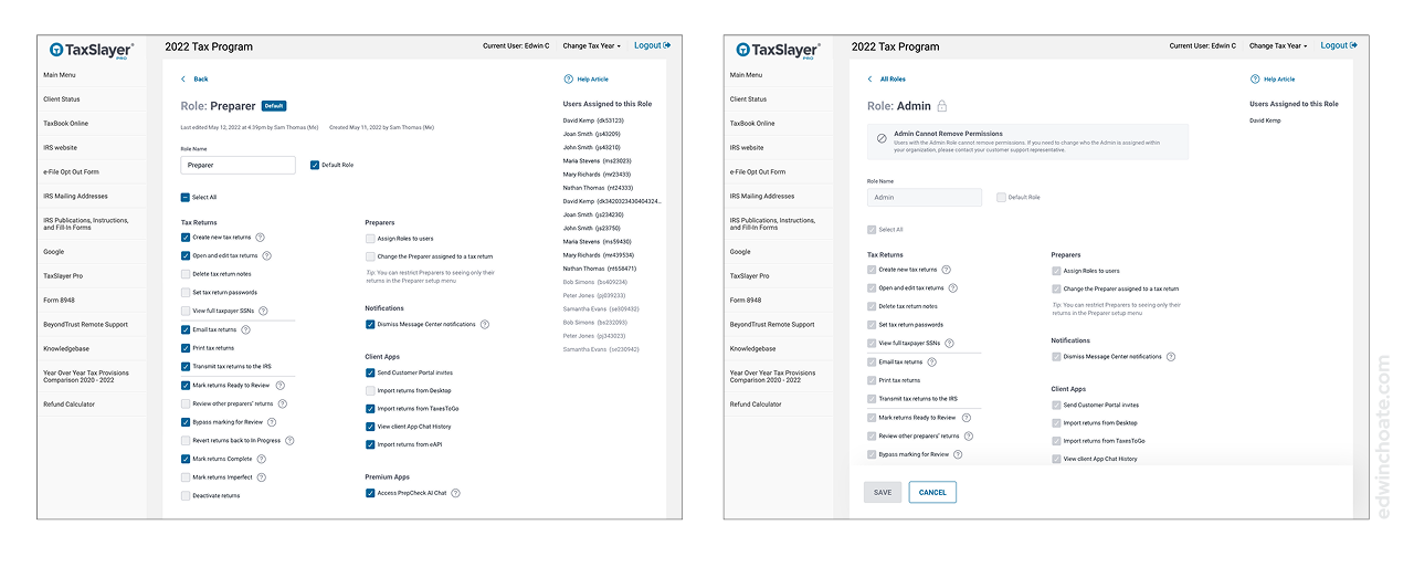
Better Explaining How the Admin Role Works
When talking with stakeholders, it became clear to me that the Admin role had some special logic which made it work differently than the other roles, but the user interface wasn’t doing a good job of explaining to first-time users how this works, which was causing confusion and errors.
Making It Easier to Copy Roles (Saving Work)
One piece of feedback I kept hearing from stakeholders was that people have to spend too much time clicking every time they create a new role. Each time they make a new role, they have to start from scratch and go through every single permission and click, click, click, click… until they’ve got the role set up to their liking. And then they’ve got to do this all over again if they want to create another role.
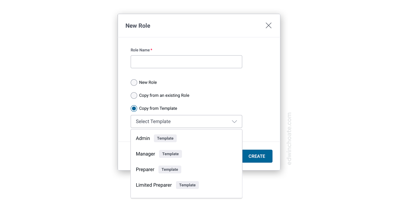
In addition to letting the user copy an existing role when creating a new one, I introduced this concept of a Template. The template represented four roles that we commonly see in our domain. I pitched this to the engineering team as a low-effort thing: all this is is stock data in the database that comes with the application. It’s a set of hard-coded suggestions, four roles that somebody who knows what they are doing in the domain has pre-made for you, take them or leave them. Or, you could use them as a base and customize from there, potentially saving work.
- The Copy feature was intended to save clicks
- The Templates feature was intended to save thought: why make the user think of these roles from scratch if there are common roles we already know about in our industry?
Successful Launch
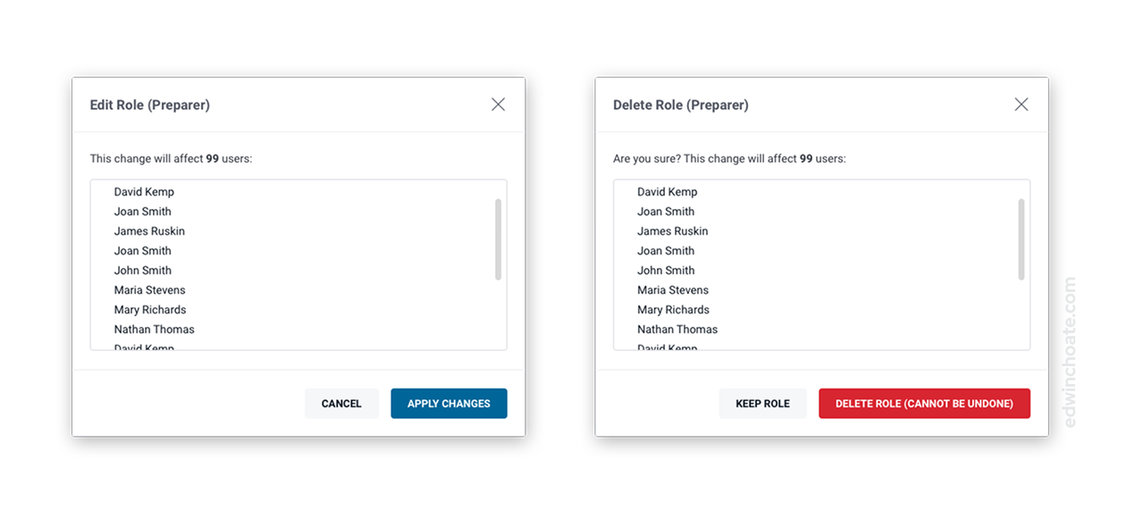
With an interface with this many consequential settings, there was a good chance we’d missed something. The team was able to be thorough, however. When the new interface launched, there were a couple permissions that we needed to tweak and fix (I anticipated this and made myself available to alter the design as a follow up). The vast majority of the changes went smoothly. This was a testament to the team’s attention to detail.
Positive User Feedback
“Taxslayer has updated the Roles & Permissions menu—I really like the way they grouped things now—so much easier to navigate.”
—User
After the changes went live in the software, I found a pleasant surprise in my email inbox. A user had written this feedback and asked that it be forwarded along to the team that worked on this project. It’s always nice to see feedback like this, especially when it’s articulating precisely the goal of the project.
My Role
I proactively initiated this project; I was not asked to do this. I was the sole designer on this project, doing all of the UX design and UI design. I conducted interviews with stakeholders such as product managers, software engineers, and QA testers to learn what I needed to learn about the permissions and what they did so that I could rewrite the labels and validate the changes.
Conclusion
The roles and permissions configuration experience was something we knew we needed to fix but because it was so hairy it didn’t rank very high on the list of things we wanted to do. But, we did it anyway, and now the user experience of configuring roles and permissions in the system is all the better for it. It was affirming to receive user feedback saying we accomplished exactly that.
Let's Get in Touch
Email me at hello@edwinchoate.com, or connect with me on LinkedIn.
Read More
Only got a minute? Check out the showcase.