
PrepCheck
Summary: TaxSlayer Pro's first-ever generative AI feature, PrepCheck, is an AI-powered chat application for asking tax questions. In designing the interface, I used conventions from messaging apps so that the experience would be familiar for users. I mostly focused on user interface design for this project, and I designed the logo.
The Ask
I was asked to design an AI chat bot that enables tax preparers to ask tax-related questions and get quick answers from reliable sources (mostly the IRS). It was prescribed to me that the feature would be a chat bot. This project was on a tight timeline (one sprint), so the design turnaround needed to be quick. I just had a few days to produce the design, so there wasn’t much time for research or deliberation.
The User
The target user for this product is a tax preparer, someone who puts together tax returns for a living and has a deep understanding of tax. The intended use of this product is for preparers to ask tax questions to quickly double-check their work, as they work on preparing tax returns.
What If It Didn’t Have to Be a Chat Bot?
Perhaps a chatbot is the ideal UX for the users’ needs here. But, without more user research, we don’t know that for sure. I saw it as doing my due diligence to take the time to think about some alternative solutions.
Alternative Ideas
- Dynamic tax documentation center
- Dynamic guidance embedded inline in the tax form UI, in context
- Personified assistant that “follows” you throughout the application
- A smart FAQ panel that changes depending on the user’s place in the application
- Smart elastic search
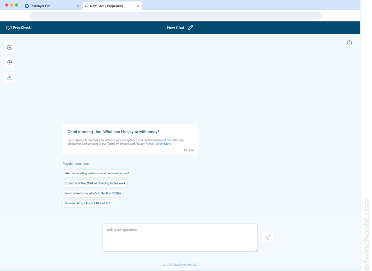
Making It Intuitive: Building on What Users Already Know
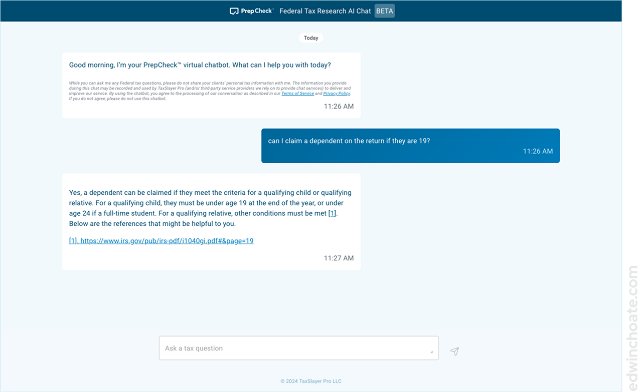
I set out to produce a user interface that would be familiar at first use. To accomplish this, I sought to use conventions users already know from messaging apps. In the book Make It So: Interaction Design Lessons from Science Fiction, authors Shedroff and Noessel describe an effective way of making something intuitive: build on what users already know.
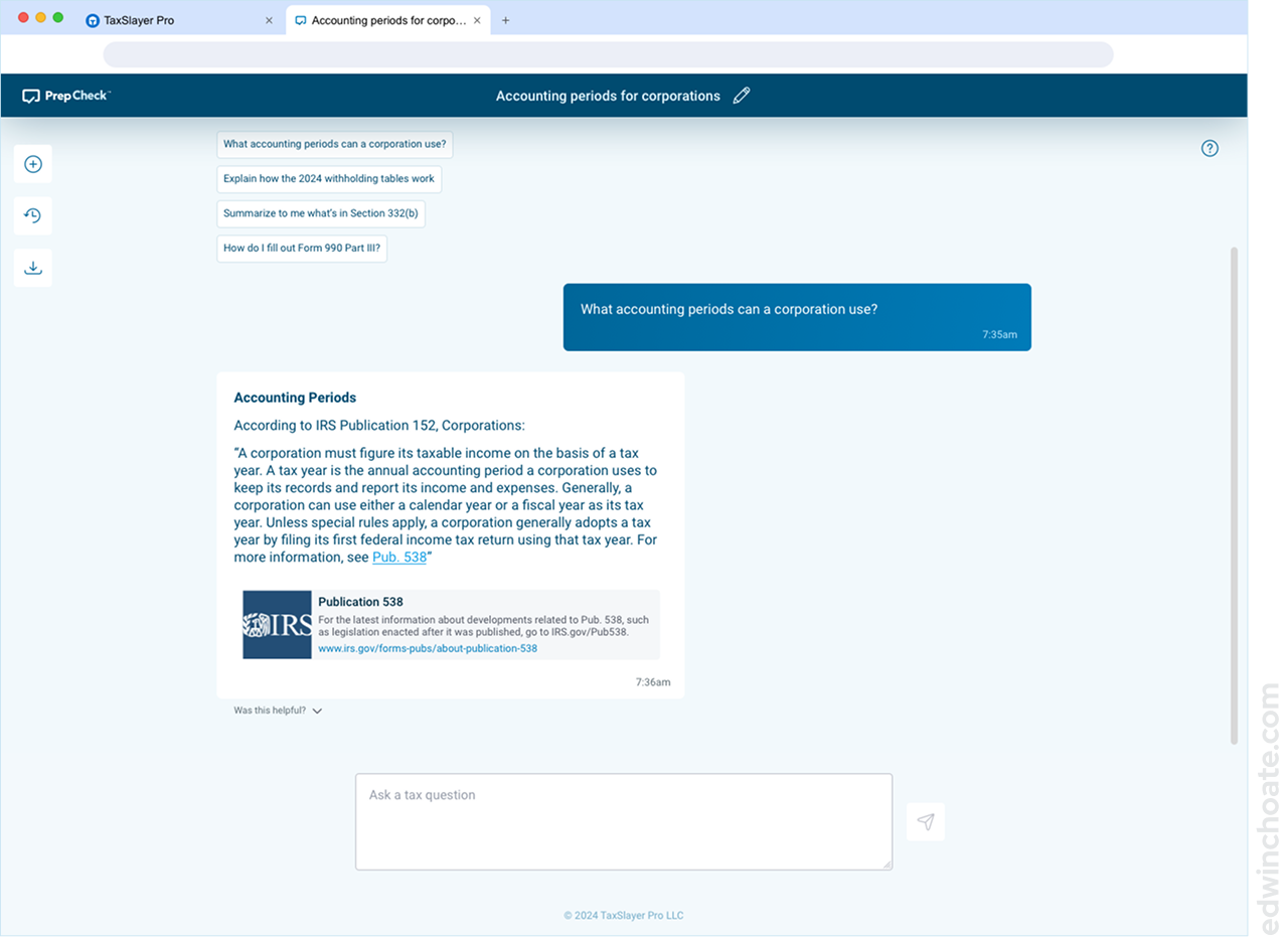
How Might We Improve the Chat Experience?
At its core, this was going to be a basic chat interface, but I sought to think about ways we could push the envelope. I added a few feature ideas into the prototype as food-for-thought for the stakeholders.
Some of those ideas included:
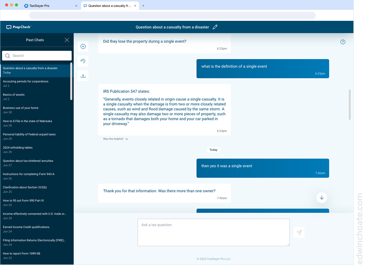
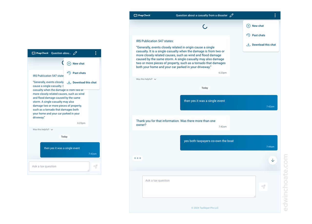
- What if the user wants to download the chat?
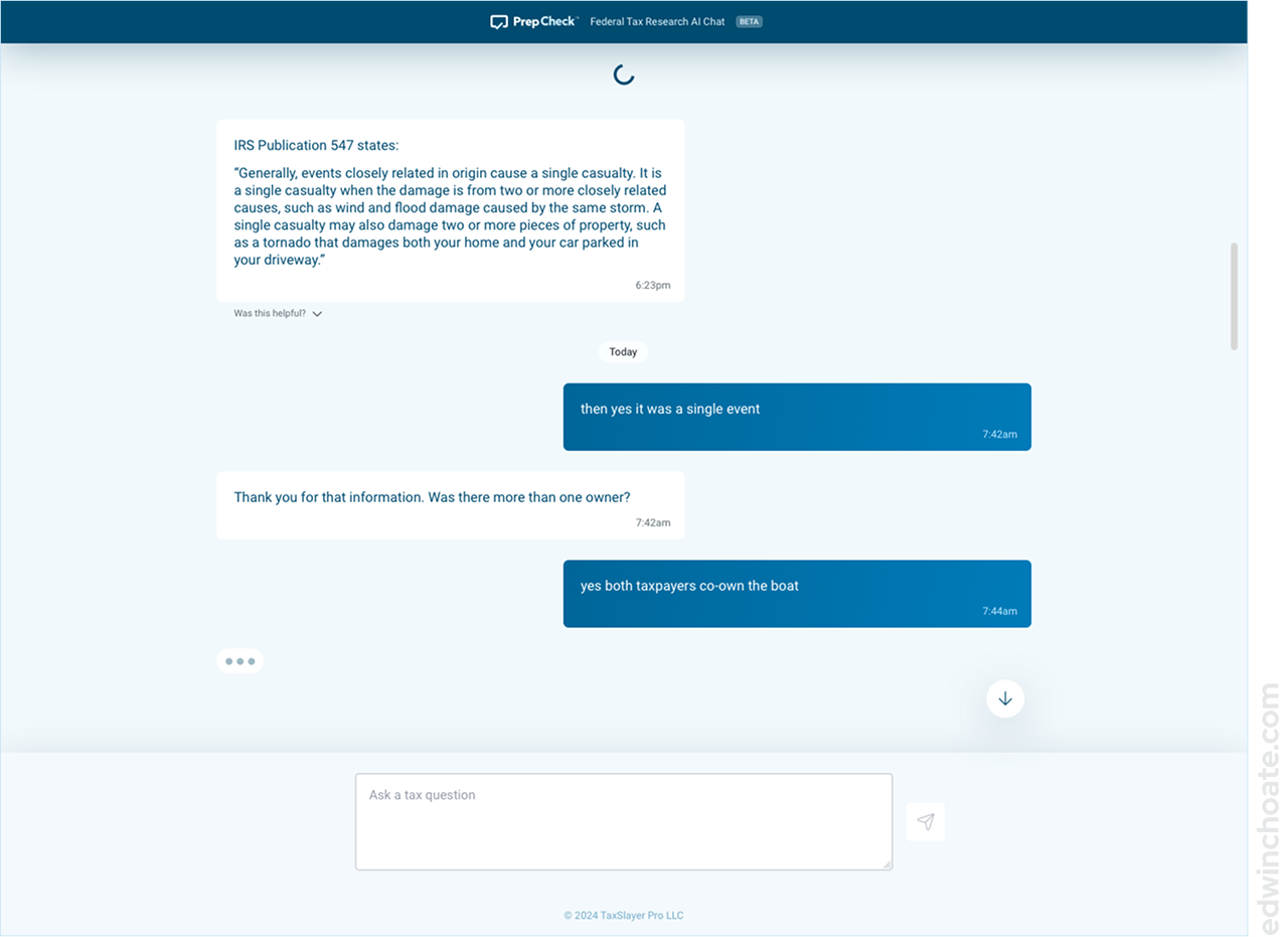
- A way the user can react to the bot, to tell it whether or not its response was helpful
- Displaying richer link previews in the chat (i.e. Open Graph metadata)
- What if the user wanted to name the chat? What if the AI automatically created a default name which could be edited?
- What if the user gets stuck with something and wants help?
None of these features were being asked for, but I wanted to get the stakeholders to think more outside of the box.
A nice benefit of keeping the interface uncluttered and minimal in the desktop view was that when it came time to work out the responsive layouts for mobile and tablet, very little of the interface needed to be rearranged to get it to work on smaller screen sizes.
Designing the Logo
I’d originally titled this project Tax Talk in the design artifacts, but this was just a placeholder title so that I had something to put in the designs. I felt that this was a product that needed to have a brand identity so I brought this to the attention of the marketing department. I waited until I got the official name from marketing before working on the logo, because I wanted the logo to tie in with the product name, as well as create a wordmark containing the product name.
I embarked on an ideation exercise where I worked up about a dozen logo ideas. The final logo incorporates the shape of a checkmark within the shape of a chat bubble. The most time-consuming part of creating this logo was getting the proportions right. It required fine-tuning to get the checkmark shape and the chat bubble shape to both look right at the same time.
- I incorporated the checkmark to clarify that the word check means “checking your work” (as opposed to other uses of the word like “writing a check”)
- The omission of AI from the logo was intentional, so as to future-proof the product in case we pivoted
- I incorporated the chat bubble shape to clarify that this is a chat tool, since the name “PrepCheck” doesn’t reference chatting
Designing the Beta Version
I made a simplified prototype artifact for the initial release: the beta version of the product. After talking with stakeholders, we liked the idea of explicitly labeling the software as a beta version somewhere in the interface.
I worked out the bare-minimum MVP design for the product and reworked the header of the UI to reflect that it’s in beta.
What Was Built
The engineering team took up the work to build the Beta design, and I consulted with them as they had questions.
My Role
For this project, I mostly acted as a UI designer. I was the sole designer on the project. I didn’t do much in the way of user research or UX design here, due to the contraints of the ask. If I’d had time for research, I would’ve tried to understand more about the core problem we were trying to solve.
It seemed to me that much of the potential value of this feature is speed: helping the user quickly look up or remind themselves of specific bits of tax knowledge as they work on a tax return. I would’ve been curious to learn what kinds of questions slow users down and when in the tax return preparation process this occurs.
Conclusion
This quick project was an opportunity to design for AI. I sought to make the experience intuitive by building on what users already know: messaging apps. I was able to exercise my UI design skills on this project to perform a quick turnaround.
Let's Get in Touch
Email me at hello@edwinchoate.com, or connect with me on LinkedIn.
Read More
Only got a minute? Check out the showcase.