
NCR Design System
Summary: I worked on the NCR Design System from its inception, focusing on the design of the user interface components in the system as well as the design system documentation site.
Project Goal
The goal of this project was to implement a design system that provides web & native app component designs, working code components, and the relevant accompanying documentation so that designers and developers at NCR are equipped to build products quickly and efficiently with a common design language.
Deciding Which Components to Include
My team and I quickly realized the importance of understanding and prioritizing which components would be included in the initial release of the design system. We knew that we wanted to release an early alpha version of the design system so that we could go ahead and start collecting feedback on it, thus we needed to be intentional about which components made the cut.
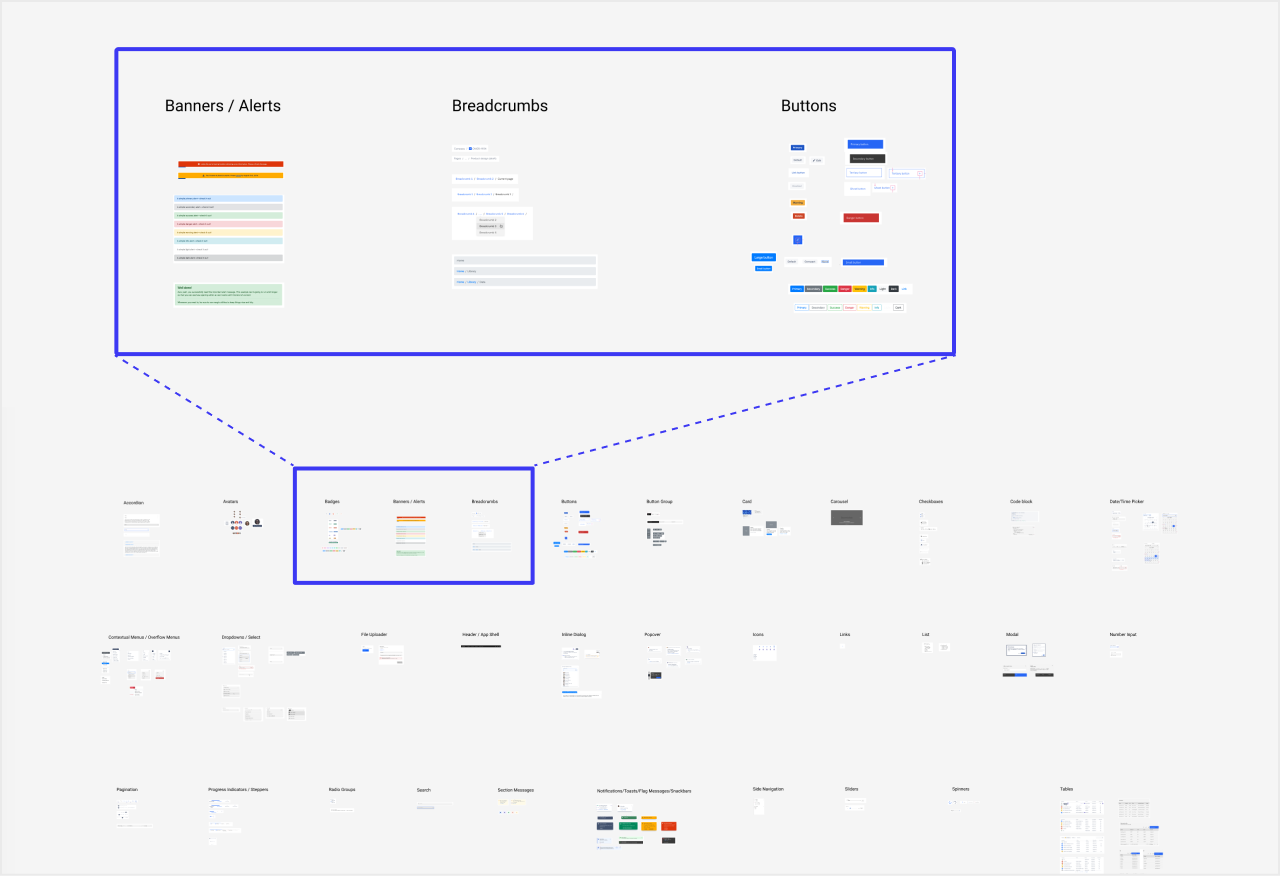
Market Research - Design System Sites
Fortunately, there are lots of design systems to check out online. I used this fantastic list of design systems by @alexpate on Github to find some of the best design system sites out there from which to draw inspiration. As I researched, I took screenshots and created an affinity map to break design system sites into their composite parts. This allowed me to spot patterns and understand conventions across the various design system sites.
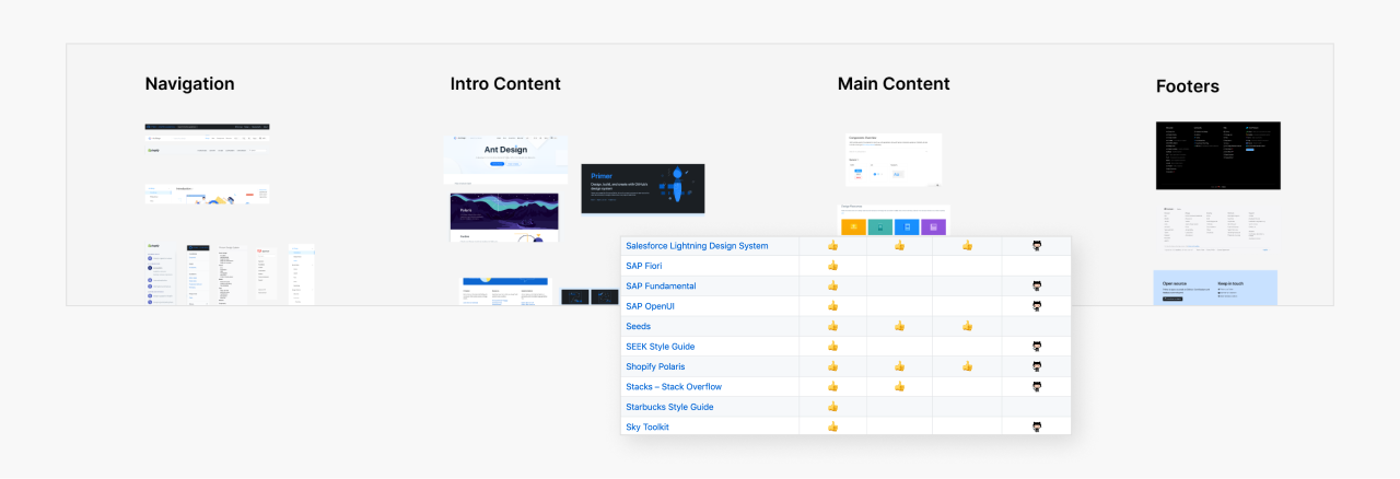
In particular, I analyzed:
- Adobe Spectrum
- Alibaba Ant Design
- Atlassian Design System
- Firefox Photon Design System
- GitHub Primer
- Google Material Design
- IBM Carbon
- Mailchimp Content Styleguide
- Microsoft Fluent
- Shopify Polaris
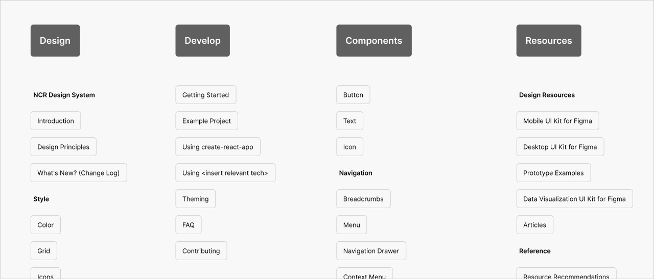
Next, I created a sitemap to focus purely on information and site structure. By this time, my team and I had narrowed down our list of components we wanted to include in the alpha release, so I made sure that the site structure I was planning would be able to accommodate the components we selected, while leaving room for future iterations of new components.
UI Component Design
With our set of UI components established, we began working through our backlog, component by component. I was one of three designers who worked on designing the UI components. We were responsible for thinking through the states and variants that each component needed and executing the designs of those states.
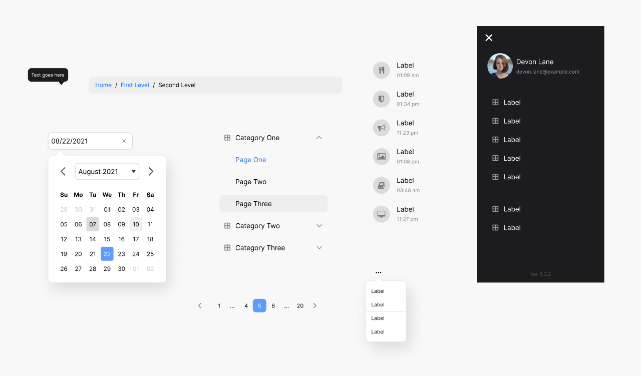
In total, I designed these 11 components for the alpha release of the design system:
- Breadcrumbs
- Context Menu
- Date Picker
- List
- Menu
- Navigation Drawer
- Page Header
- Pagination
- Tabs
- Time Picker
- Tooltip
Prototyping the Design System Site
I owned the task of prototyping what our design system site might be like. I created a prototype that used the patterns and conventions I observed in my research. As a design team, we hadn’t yet established a look-and-feel we wanted to go with, so I prototyped in low-fidelity to focus on just the structure.
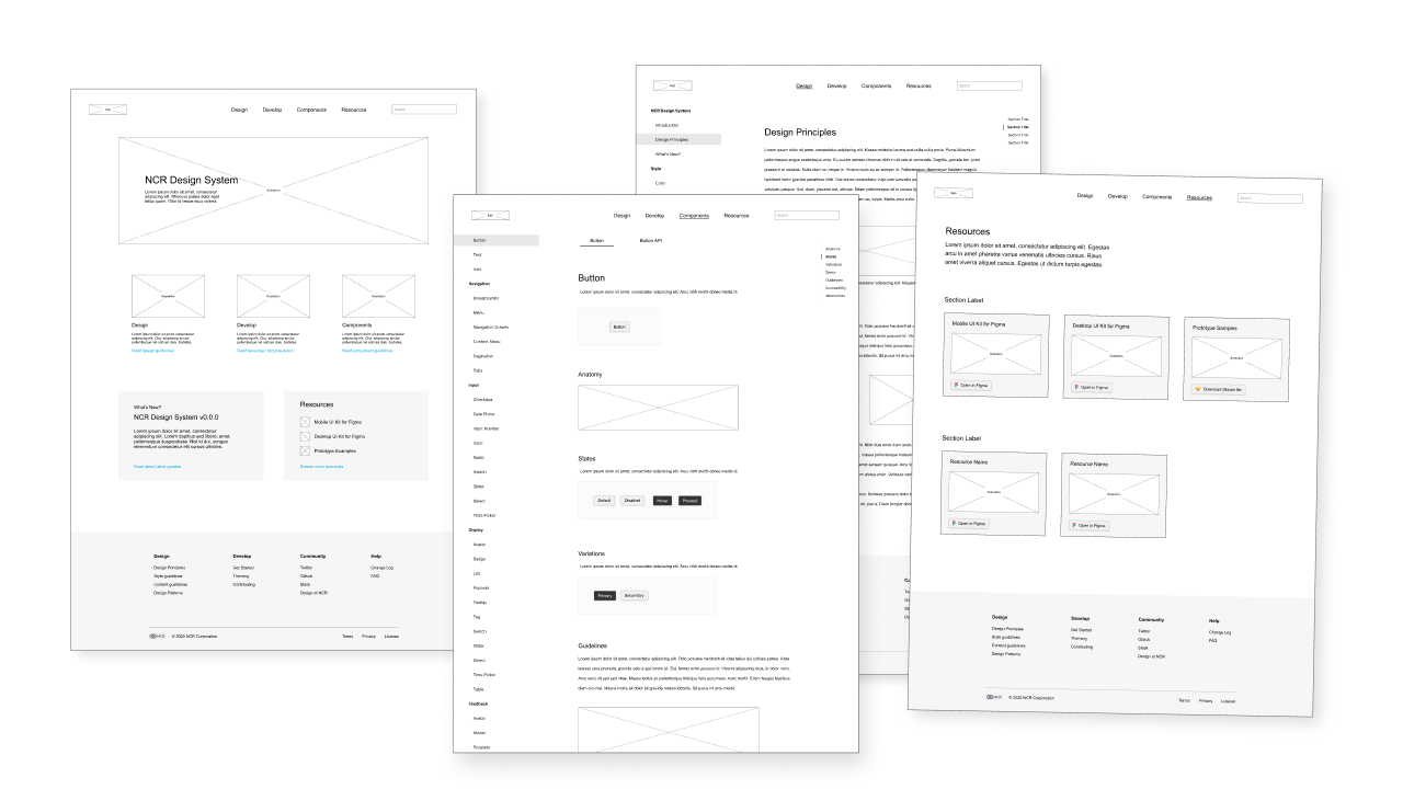
My team used the low-fidelity prototype I created as the basis for the final product. The front-end developers found the designs easy to implement because they were conventional. They were able to use external component libraries to build the site quickly, rather than having to reinvent the wheel.
Final Product
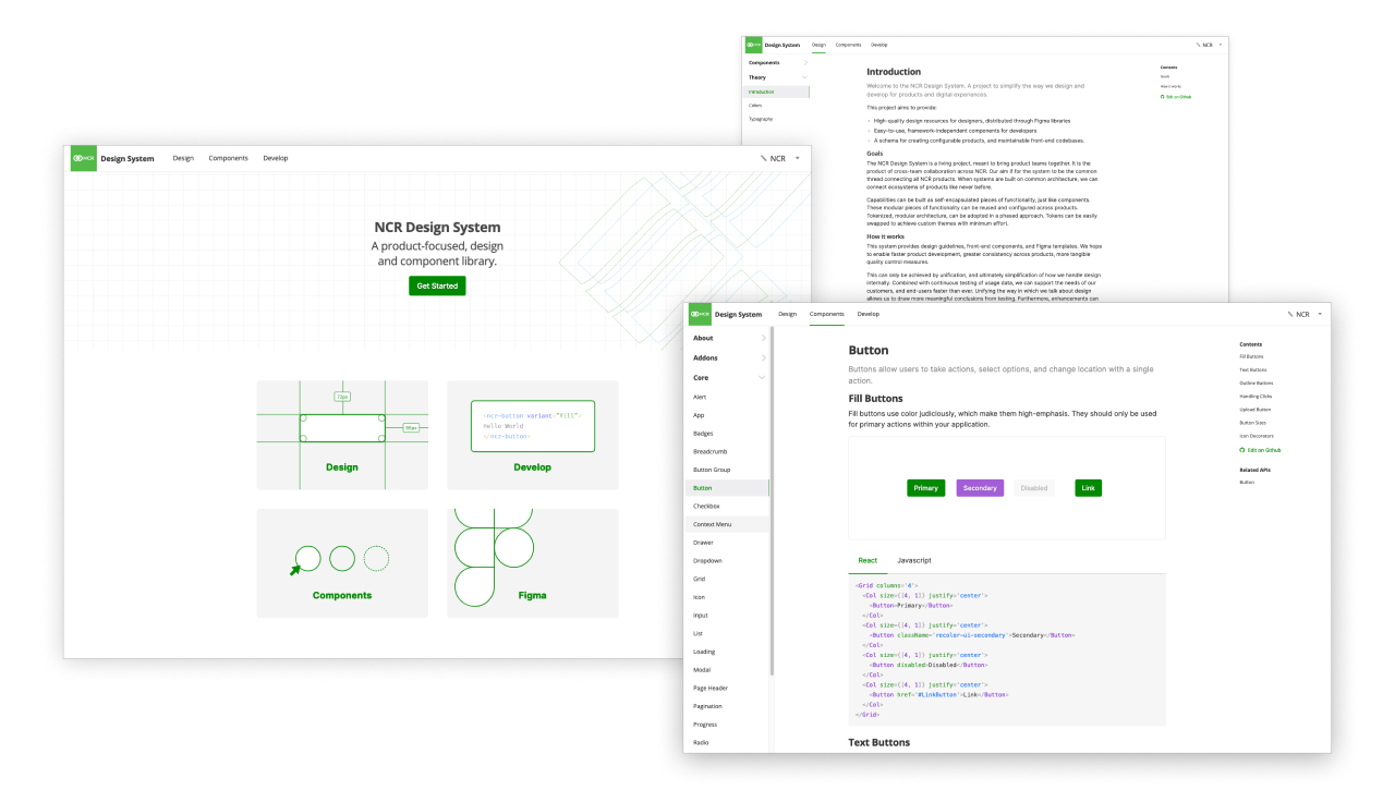
As of this writing, the design system is currently in alpha. The components are available as Web Components and React Native components. As the design system matures, we will continue to iterate on our component set, add new components, refine the existing components, and conduct ongoing usability tests with internal designers and developers using the system.
My Role
On this project, I worked with a team of three designers (myself included), one UX researcher, and three front-end developers. The designers focused on the UI component design and designing the site. The UX researcher focused on written documentation (in collaboration with the designers) and user testing. The front-end developers focused on building the UI components and building the site.
I wore a few hats on this project, including:
- UI component designer
- information architect
- market researcher
- design backlog planner
On this project, I did not focus on the high-fidelity designs for the site or writing documentation.
Conclusion
It was a great experience to be part of a team designing and building a design system from scratch. I learned a lot about component design as I worked on this project. Our team was able to release the alpha version of the design system on-time and on-quality and put the project in a prime position for further iterations through continued adoption of the system.
Let's Get in Touch
Email me at hello@edwinchoate.com, or connect with me on LinkedIn.
Read More
Only got a minute? Check out the showcase.