
Menu Maker
Summary: As UX Lead, I led a small design team at NCR through an iterative design process to design a menu configuration tool for medium-to-large restaurant chains in close collaboration with product and engineering. Our research-backed efforts led to greater organization of information and ease-of-use in our final design.
The Problem We Were Solving
With the advent of order aggregators like DoorDash, Grubhub, and others, customers were having a difficult time managing their point-of-sale menus alongside their delivery menus. There was pain in this area, where too much re-work and duplicate effort was required to set up the different types of menus in tandem. This setup process was too tedious and effortful.
Leading a UX Team
For this project, I served as lead UX designer. I led a team of three UX designers and played a significant role in coordinating between the members of the design team, the product stakeholders, and the three engineering teams working on building the product.
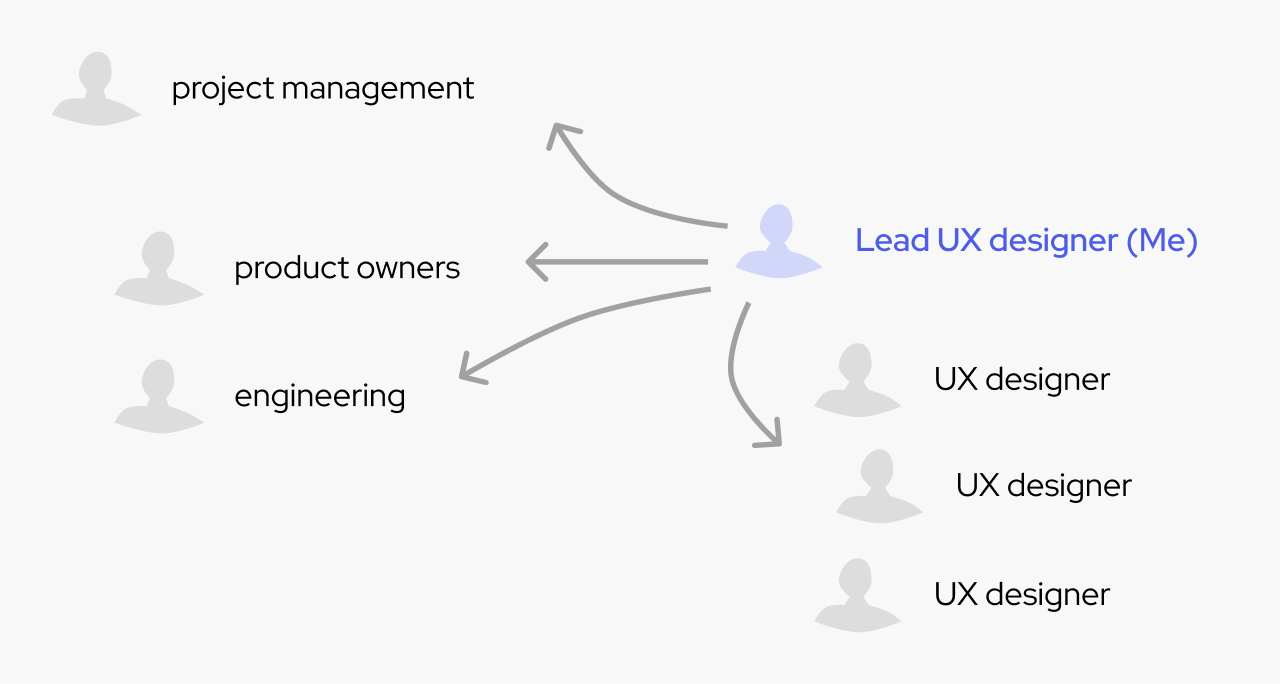
This was my first experience in being a lead UX designer and working in collaboration with engineering on such a large project. I learned a ton through this experience about mentoring junior designers, collaborating with product teams, scoping design work, and managing changing product requirements.
Customer Brainstorming Workshop
We kicked off the project with a design thinking brainstorming workshop that included several customers in the large-scale restaurant space. The director of our UX research team was the lead facilitator for this workshop, and I played the role of assisting her with the facilitation and preparing relevant artifacts in advance of the workshop.
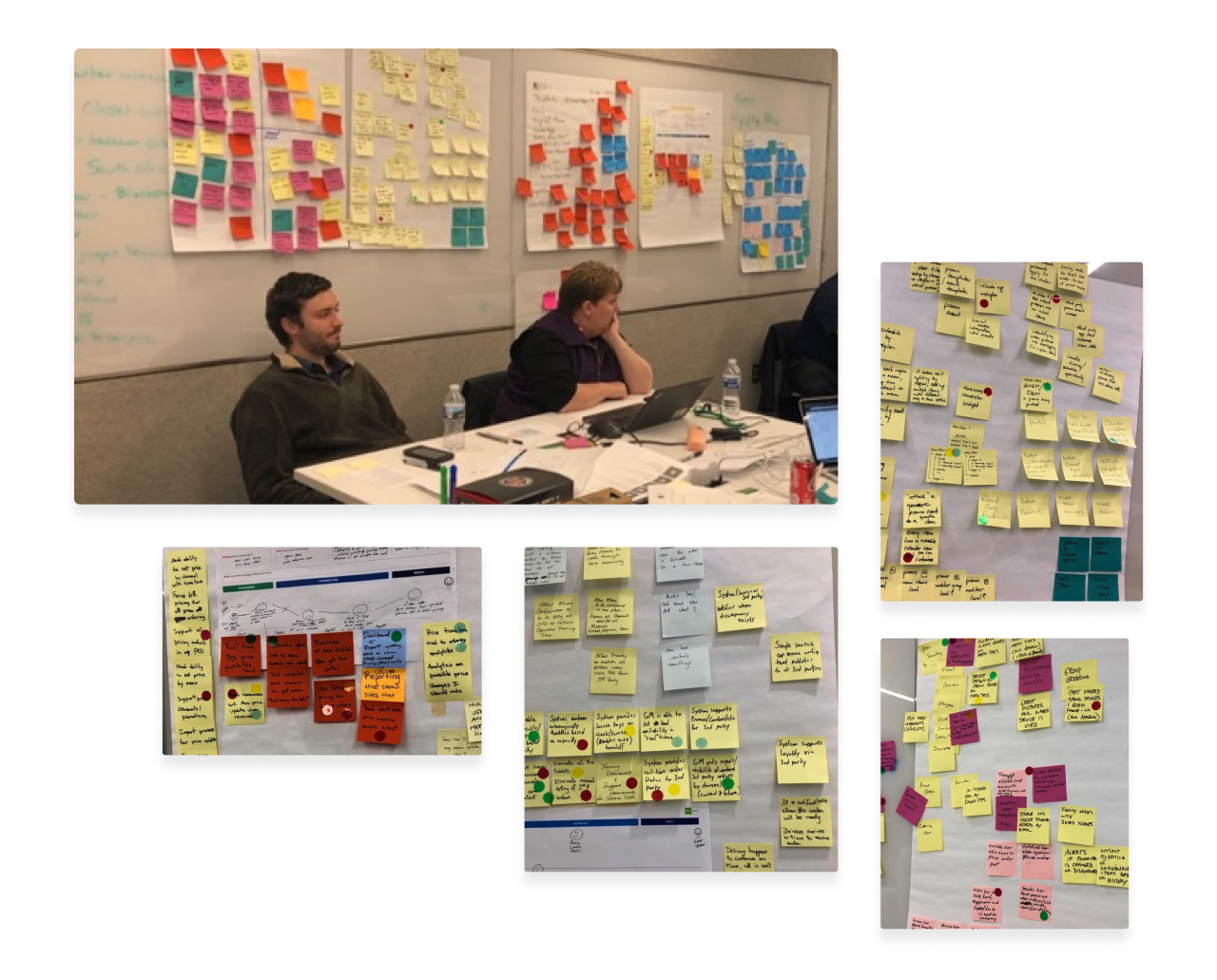
In this workshop, we walked through the design thinking process. We primed our participants with a presentation articulating the main problem we were intending to solve. Then, we walked them through exercises that got the participants to brainstorm, storyboard, and sketch out ideas as they discussed collaboratively. As the workshop concluded, there was certainly still much work to be done to flesh out the ideas more clearly, but we walked away from it having collected a high volume of diverse ideas. The customers left the workshop enthused!
Personas - Who Uses Menu Configuration Tools?
To understand the different potential users of our application, I worked with product stakeholders and UX research to create four proto-personas prior to our customer brainstorming workshop. I took the four personas to the workshop and we discussed them with our customers to discern, based on our customers’ collective experience, whether or not the proto-personas were accurate, and if they weren’t what we could do to improve them. We refined the personas together, and by the end of the workshop, we had a good sense that our personas were rooted in reality.

We arrived at four personas:
- The corporate IT menu builder - this was our primary persona. Someone who is more on the technical side, works in the corporate office of a medium-to-large restaurant chain, and has a good amount of expertise when it comes to menu configuration.
- The end-user - the customer of the restaurant. While this person never actually uses the tool we set out to make, this is the most important person to consider because ultimately all menu configurations are done in service to this persona.
- The restaurant manager - someone who’s overseeing when things run out of stock, when customers have complaints about the menu, etc. This person is downstream from the menu configuration but ultimately deals with the real-world effects of the menu and thus holds important insights.
- The corporate marketer - this person has different goals than the other personas that are important to consider such as: running promotions, specials, and seasonal items.
Deeply Understanding Menu Information
In parallel to the workshops and as my team was ramping up, I proactively seized the opportunity to learn more about how menu information works. I quickly discovered just how complex the domain of menu configuration can be. I combed through a number of online menu apps and websites from a variety of large restaurants and as I did so, I analyzed the structure of the information.

Patterns began to emerge across different contexts and I began to understand on a deep level how menu data is best represented and organized. Looking back on it, the knowledge I gained from this research effort was critical throughout the entirety of the project and enabled me to create a vision for the user experience and guide my team.
Whiteboards, Whiteboards, and More Whiteboards!
I worked with a knowledgeable team of product owners and engineers. We revisited the whiteboard on a daily basis as we created shared understanding for this project. Because of the complexity involved, we often found that there was no better way to proceed forward than a simple whiteboarding session and talking things out.
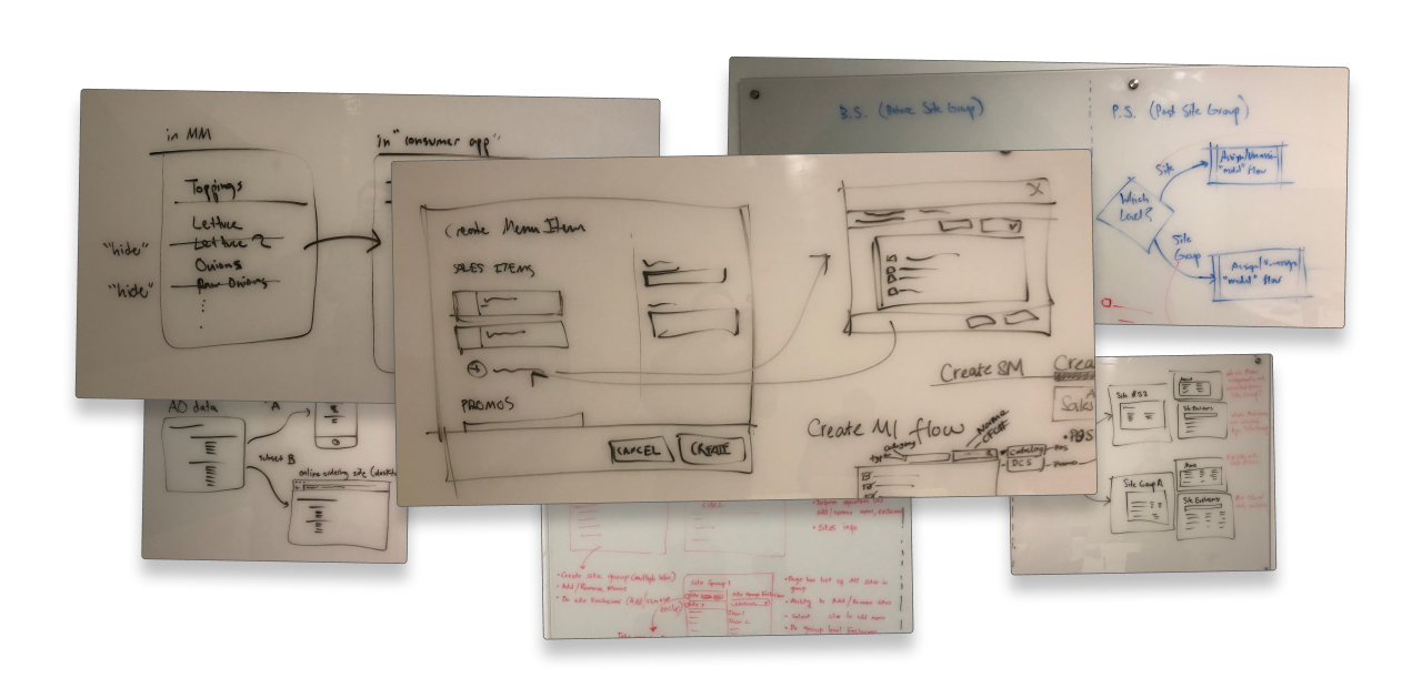
Since I was leading a team of multiple designers and we were working with a large team of engineers, creating a shared understanding was paramount. In the spirit of Lean UX, we got into the habit of whiteboarding as a team before we went too far down one path in our designs, which helped us prevent wasted effort.
Iterative Prototyping
With research, persona-writing, the brainstorming workshop, and initial sketching under our belt, I started to create prototypes to envision a solution in more concrete terms. As you can see in the figure below, the layout and structure of the design changed a good bit from iteration to iteration. (It’s also worth mentioning that these iterations took place throughout the project, they didn’t occur all at once in one stage. Rather, these prototypes took place as the project progressed, overlapping with research and testing efforts.)
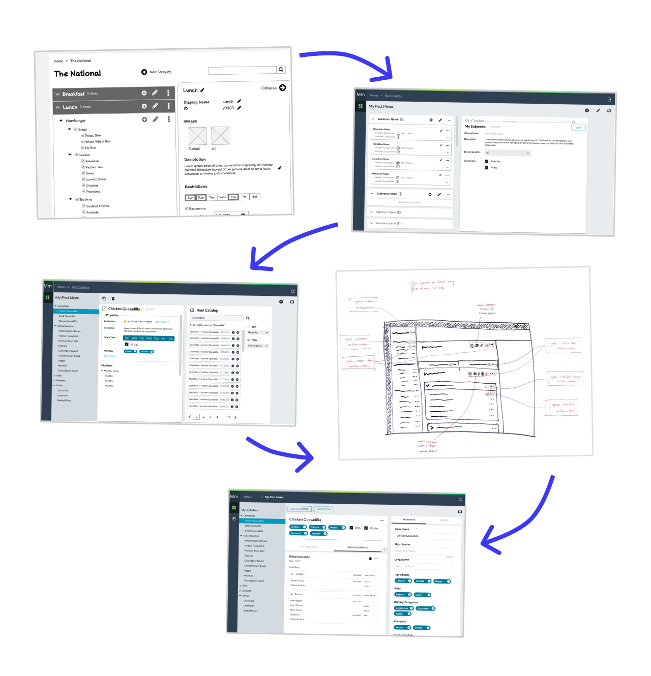
As a team, we gained more and more understanding of the problem we were trying to solve as these iterations progressed. This new understanding informed the next iterations of the designs.
Sprintly User Research
As we iterated on the design, we tested and validated our assumptions through usability studies. We held a sprintly (once every two weeks) user research sessions wherein we pulled up the latest version of the prototype on one of our laptops and guided a test subject (usually someone internal who didn’t know too much about the project) through the main tasks our app was designed to afford and we observed usability issues as they arose and took note of users’ feedback on the design overall. These sessions were generally planned and conducted by a member of our internal UX research team in collaboration with myself and the product owners to sync up on the main feature or problem we were solving in each sprint.
Customer Feedback Sessions
While the usability sessions were informal and with internal audiences, we also held more formal interviews with customers (people who matched our primary persona). In these semi-structured interview sessions, we showed the latest version of our designs and collected feedback. (This usually involved screensharing over video conference software remotely.) This expert feedback proved crucial in helping us understand advanced user scenarios the software would need to support.
Discovering a Problem with Our Design - The Navigation
At one point in the project, I received some feedback about the navigation of the prototype and I realized that we had a usability problem on our hands. We needed to figure out a better navigation, and we needed to be able to validate that it would work with real users. So, I made a prototype in Axure. I made it possible to click on any link in the prototype so that we could observe people clicking around the prototype in an unstructured way.
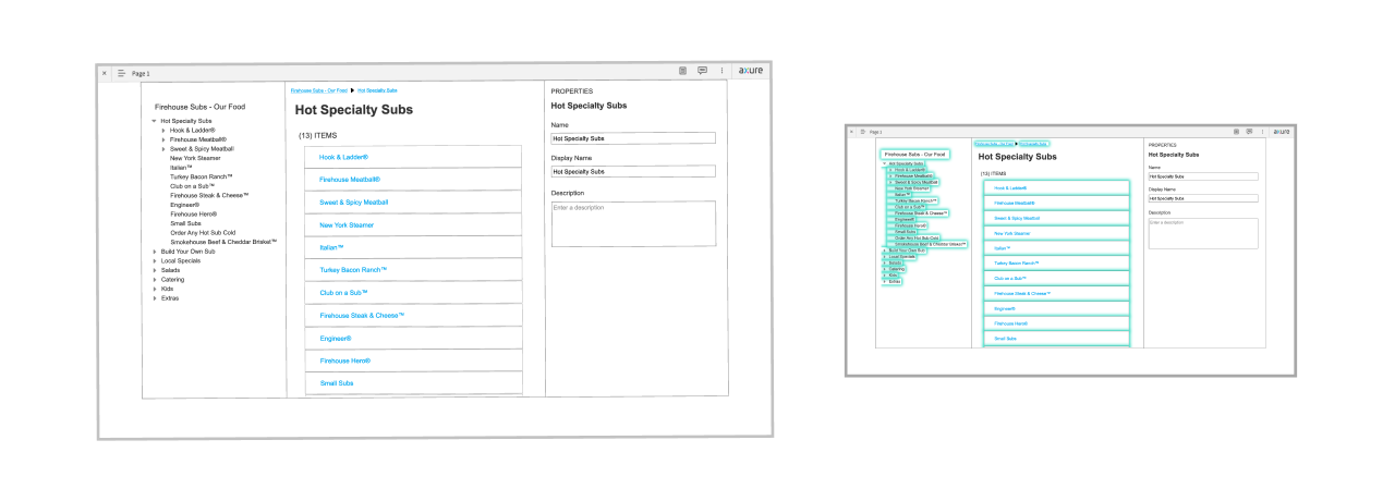
The prototype was high-fidelity from a functional point-of-view: the breadcrumbs were fully-functional, and all the labels in the UI read as they would if the app were fully-functional. (I accomplished this quickly using variables in Axure.) I prototyped with real data from a real restaurant’s website. I didn’t spend much time styling the prototype because its purpose was to represent navigation and any additional styling would’ve been wasted time and effort. I just needed this prototype to validate my assumptions and I knew I was going to throw it away once the user testing was done.
Card Sort Workshop - Organizing Menu Information
Once the core structure of the application became clearer, I saw that we needed to figure out a way to organize the more granular, low-level information the application would house. I planned a single-day card sort workshop to that end. I recruited 6 participants (internal coworkers with a rudimentary understanding of the domain) and I enlisted two of the junior UX designers on the team to assist me with the facilitation of the workshop.
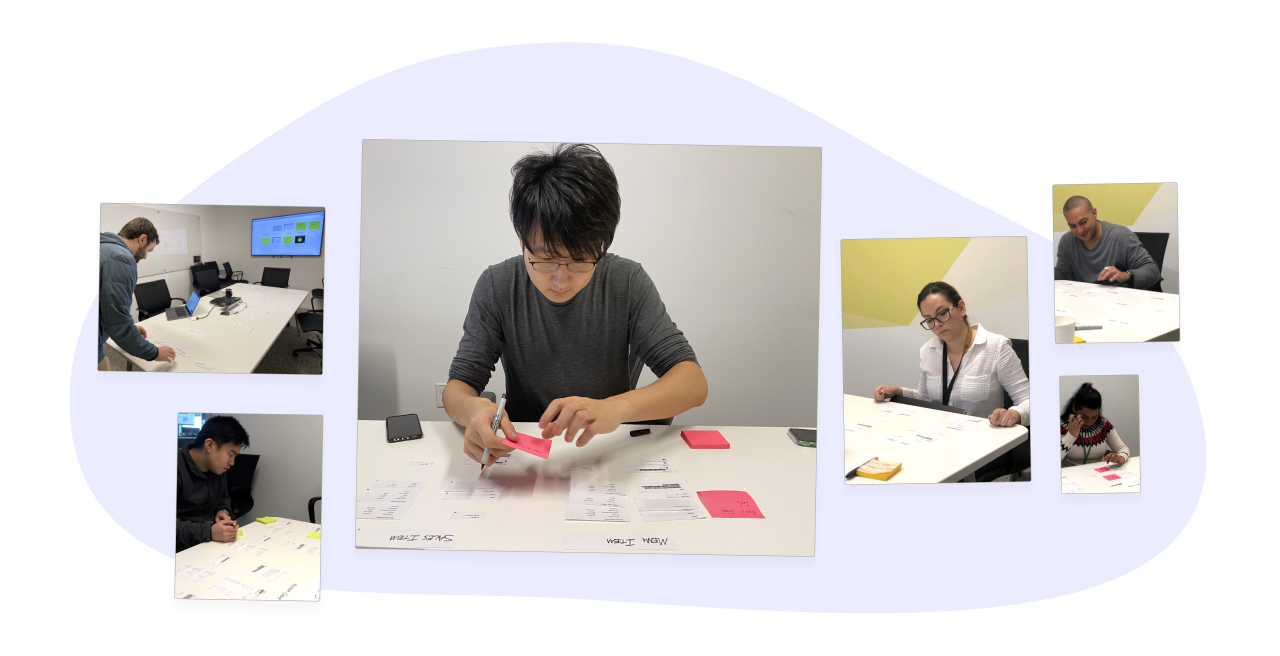
Within fixed categories (i.e. each level of the menu taxonomy), I instructed participants to cluster related information and label each cluster with a sticky note. In effect this was a hybrid card sort - an open card sort inside of a closed card sort. I did it this way because this gave me the data I wanted: how should information be grouped within each level of the menu taxonomy? - this was the main question I was trying to answer.
Using the Results of the Card Sort in the Design
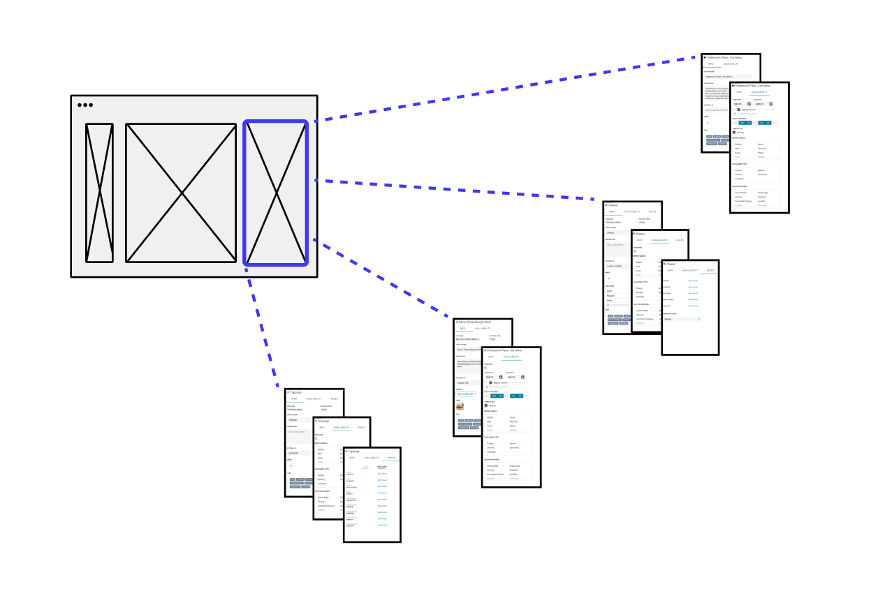
The card sort study proved valuable and informative. After the session concluded, I held a synthesis session with my UX team. I incorporated our insights into the design by delivering a series of panels that took the card sort results into account. I organized the information under three main principles:
- Consistency across levels of the menu taxonomy
- Using card sort results as much as possible
- Information appears in an intuitive order
This resulted in the concept of the Properties Panel, which ended up being an important part of our final design. (This worked in a similar way to how Sketch or Figma’s properties panel works.)
Final Product
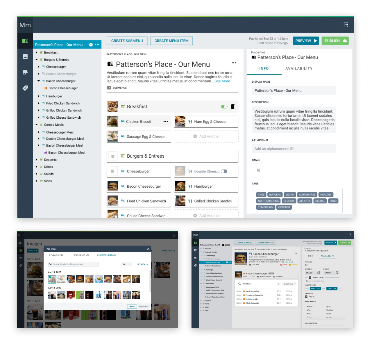
Employing the research and insights we generated throughout the design process, my team and I delivered a set of high-fidelity mockups to serve as our final design. Of course, designs are never complete, but this set of specs ultimately provided more than enough design for the development team to accomplish their planned featureset and then some! From a visual design point-of-view, the company was using a Google Material-based design system at the time. We used that design system to determine the look and feel of the product and we extended the UI components when necessary.
My Role
As a lead UX designer, I contributed heavily to virtually every stage of the project. I played several key roles in this project, including:
- UX team lead
- Advocate for the user
- Information architect
- Project coordinator
- UI designer
- Mentor
- Visual designer
- Design ops strategist
- Design systems lead
- … and probably some other stuff that I’ve forgotten about
Conclusion
I learned a ton from this project experience. As a lead UX designer, I learned through trial and error how to motivate and lead a team of young UX designers working on a complex project tackling a tough problem. I learned as I assisted with a customer workshop, facilitated by an experienced UX research specialist. I saw firsthand how valuable it is to do your research upfront, looking at what exists in the market and analyzing the complexities of real-world solutions. I saw how much more intuitive and well-organized information can be if you use a card sort exercise to gather ideas from multiple people.
We were ultimately successful in designing a simple, intuitive experience for an advanced user in a complex domain. Through the process of continually advocating for the user, we were able to prevent complex code-related concepts from bubbling up into the UI. All in all, this project while complex and challenging was a fantastic learning experience.
Let's Get in Touch
Email me at hello@edwinchoate.com, or connect with me on LinkedIn.
Read More
Only got a minute? Check out the showcase.